This website is a collection of music a record label. Each selected song has an interactive element tied to it for example on one of the pages you have to make a tree grow to add different layers to the music. To launch the interactive experience the user has to hold down the space bar which makes music start to play in snippets, whilst showing various clips from music videos.
I can imagine this website is very resource intensive so it may not be very usable for those with slow internet speeds. Also the experience requires sound as a major part of the experience which excludes those without desktop speakers or headphones from partaking in the interaction.
In this website it has be split into three clear sections: mountain, road and triathlon. This makes the website extremely easy to navigate and makes it very user friendly. I like that the website is very visual seeing as the website has a high resolution background for each section of the website. There are also ways to find out more information for each section which are within buttons so they are hidden, this makes the home page of the website look very clean.
When you open this website the image at the beginning comes together from either side of the screen until they line up to make the full image. This makes the website catch your attention whilst looking slick and professional. Also as you scroll down the webpage images begin to appear.
However, I did have some problems when reducing the size of the webpage window, I noticed that some of the text moved to weird places and some of the images started overlapping.
This website is of someone’s blog/portfolio. It is very responsive (as shown in the pictures above) since the text resizes and rearranges when the browser size is changed. I also like the dark theme of this website since it won’t strain the users’ eyes. I like the simplicity of the website and that when the browser is set to the smallest size it brings up a navigation bar at the bottom of the page.
I decided to inspect the HTML of this website to see what was used to create this website. The website has made user of various divs to layout the page.
Proposal
Project Proposal
BTEC Interactive Design
BTEC Level 3 BTEC 90 Credit Diploma in Art and Design (Interactive Media)
BTEC Level 3 BTEC Extended Diploma in Art and Design (Interactive Media)
Learner Name: Owen
Specialist Area: Interactive Design
Date: 24/05/16
Section 1
Working title: HTML5 Responsive Portfolio
Target Market
Employers and professionals looking to hire someone.
What you will work towards producing: (Detailed description of your proposal)
I will be working towards creating a responsive web portfolio using HTML5 and CSS.
Section 2
Influences, starting points and contextual references:
Other online portfolios by other artists in a similar field.
Early ideas research and sources: (What are your sources for contextual and personal research?)
I have been looking at other professional portfolios for inspiration.
Section 3
Intended techniques, non digital and digital processes:
I will be using Brackets as my code editor and will probably be using Photoshop or Illustrator to create visuals for the website.
Timescales: (Please insert weekly targets of what you intend to work on from the beginning to the end of the project)
Week 1: Research
Week 2: Ideas Generation and Ideas Development
Week 3: Ideas Generation and Ideas Development
Week 4: Produce Outcome
Week 5: Produce Outcome and Evaluate
Section 4
Proposed methods of evaluation: (How will you evaluate your project?)
I will be evaluating my own work and will be asking for others opinions as part of my evaluation.
Ideas Generation
Here’s a basic example of a responsive website I made. The red square is 50 percent of the size of the browser so when the browser is changed the square changes size.
Here are some ideas I have come up with for possible website designs. I like the idea of including some sort of parallax in my website because I feel that it makes the website stand out from other portfolios.
Here is the paper prototype for the web portfolio. After this test I feel I need to incorporate an about section in my portfolio to give some information about myself.
Ideas Development
Here is an example of a website with parallax I created by following a YouTube tutorial.
I added media query to the css so that when the browser has a width less than 500px it would turn light blue and a navigation bar would appear.
Here is the code used to make this happen.
I added in this piece of code which allows the navigation bar to be fixed to the top of the page whilst scrolling down the page.
Here is a rough draft of a website I will be creating.
I added a contact box at the bottom of the website. Here is the website at two different sizes. The three images represent three different section of the website, these will be able to be clicked on which will be linked to separate pages that go into more detail on the certain subject.
Here is the html/css code used to make the changes to the website.
Here is a demo of the draft website. I added hyperlinks to the images and made the images change when they have been hovered over.
I added a home button to all the web pages so that the user can go back to the home page easily. It also decreases the opacity of the button when it is being hovered over by the user.
I also added a minimum width and height for the three image links so that when the viewport becomes a certain size the images don’t get any smaller in size.
Produce Outcome
I decided to create a tiled animated background for my website (I’m still not sure whether to keep this addition or not).
I decided to remove the animated background but I have started to add in pictures of my work for the links. I also added in my logo for the home button.
I have started working on the page for Illustrations. As the video shows I have made it so the images enlarge as they are hovered over. This feature makes a specific image easier to see.
Here is some of the css code used to create this grid. I still need to add more images to the grid to make it look more complete.
In this video I show how I have added some animations into the website and I also set the background to the same colour as the logo background.
Here is the html used to make the divs link to the desired YouTube video.
I have started working on the mobile layout of the website.
I have been using media queries to control when the images format themselves into a mobile friendly layout. This query activates when the width of the webpage is below 500px and the height is below 700px. I am trying to adjust the layout so that the images don’t overlap each other when the webpage changes size.
I have applied the mobile layout to the animation page so now that is also optimised for mobile use. I also make my code more organised by reducing the amount of repeated lines of code in the media query section. I realised that a lot of the lines of code are inherited by the original class so they didn’t need to be repeated if they didn’t need changing.
As you can see the code is far more concise than previously.
I decided to completely redesign the layout of the home page because I felt it had too much blank space. So I decided to make the main focus of the home page to be the three links that go to illustration, animation and 3D modelling (3D modelling is currently a work in progress. I also included a parallax effect to the images because I thought it looked professional and more interactive. I need to reposition the contact div so it is not obstructing the final link.
I decided to up date the contact box at the bottom of the page so that is the last thing you see on the page. I also changed the colour to a grey that is slightly darker than the grey in the background. I also added an image to the 3D modelling section.
I was noticing a significant amount of lag on the front page when resizing the page and this was due to the large animated gif in the animation section so I decided to replace it with a static image but when the image is hovered over it begins to animate. This has improved the performance of the home page significantly.
I felt the images were too small when the webpage was in the four columns format so I decided to add a new format that has three columns that goes in between the mobile view and the large webpage view. I feel this makes the images easier to view at different sizes. I created a new media query for a width below 1000px, that is when the three column format is activated.
I have now applied the three column format to all of my pages excluding the home page. I have also made sure none of the images overlap.
I have now setup the website so that it works when the webpage is full size on the screen. I fixed all possible ways of the websites images overlapping with each other so the website is more accessible at larger sizes.
I decided to change the layout of the title because it started to causing some overlap when the website was viewed in larger sizes, so I put all the title on one line instead of two.
Final Evaluation
Overall I think this project worked pretty well although some changes had to be made to the original design to make the website functional. Originally I wanted the website to have an interactive background which would allow the user to scroll up and down the page and the background would change as this happened. Instead I decided to make the front page of the website focus on my artwork instead of an interesting background because I felt displaying my work is far more important than showing off a gimmick.
As far as responsive design goes I feel I have achieved this successfully. Every page of my website can be viewed at a variety of sizes whether that be mobile size, tablet size or desktop size. I made sure I designed my website with the mobile platform as the main priority.
If I was to create this website again I would have made a custom made background instead of just a single colour. I would have also made this background interactive is some way. Also I would have worked out a more efficient way to add more content onto my website because I had to change every media query individually when new content was added to my webpage. I probably could have reduced the amount of coded needed if I used a responsive layout like Bootstrap but I lacked the knowledge to use it effectively.
While this experience was running I saw one of the pieces around Bristol which was the kangaroo jumping up and down some steps. It was created by a projector projecting an animation of a kangaroo onto the wall and only turned on at certain time at night.
Overall I think this experience worked well because it made me and other people stop and pay attention to their surroundings rather than go into “autopilot” and walk home or to work.
This is the winner of Watershed’s 2014 Playable City Award. As people walked through the light their movements would be stored in the lampposts’ memory and then played back when someone else would walk past.
I also had first hand experience with this interactive experience. At first when walking through the light I though it was just a regular lamppost until I realised that there was a shadow there which wasn’t mine. This was a very interesting experience and lead to me walking back through the light several times to try and work out what was happening. I think this is what makes these playable city experiences so successful, the fact that you pay attention to something that you usually wouldn’t notice. This is something I will have to look into doing when design my playable city mobile game.
The main mechanic of this game is buying virtual land to build up an empire and gain more money to buy more land. The only way you can buy land is by being in that area and having enough in-game currency so it requires the user to be in different areas to proceed in the app. This encourages people to be active and explore places they wouldn’t usually visit.
I’ve always liked the idea of tycoon games so this app seems fairly interesting and engaging to me.
I decided to try out the app “Ingress” because it related to the app I will be making for my final piece since it uses GPS tracking as a core mechanic of the game. From what I could tell when playing the game, the game consisted of going to areas and hacking into waypoints people have marked out. However, when playing this game I found it very difficult to understand and there was a lot of information to consume when first loading the app.
I do like the concept behind the app but it seems too complicated for someone who is new to playing games and it is not very intuitive to use.
This game also relies on GPS tracking for the gameplay to work. This game looks fairly similar to GPS Tycoon but instead of buying property you have to build mines to gain money and resources. You can also steal other peoples’ resources if you are nearby.
I also find the concept quite interesting, however, I feel it would be hard for new players to start off in built up areas because there maybe a lot of more advanced players nearby which might make gameplay difficult.
Legal and Ethical Constraints
One of the main problems I may face when creating this mobile game would be privacy. One of the requirements of the brief is collecting data from those who have used the app so I will have to setup some sort of privacy policy. According to law, if your app collects data in any way, you should have a privacy policy that discloses what data is collected and how it is used. Privacy laws are even stricter under the Children’s Online Privacy Protection Act, or COPPA. This is a law that applies to apps that are likely to attract children under the age of 13 and that collect data from them. Some companies have faced serious financial penalties for failing to meet the COPPA requirements. So for my mobile game I may have to not collect data from those who are under the age of 13.
I will also have to include a terms of use agreement to go over the rules for how the app can and cannot be used, this will lower the possibility that someone can sue me if something bad happens while using the app. In this terms of use agreement I will also have to go through possible health and safety risks, such as making sure the user doesn’t cross the road while using the app because this may lead to a dangerous situation.
I need to include a notification that lets the user know that their location is needed to make the app function correctly and let them disable it easily.
I will also need to make sure the app doesn’t discriminate against those who have disabilities. For example, if there was a waypoint on the map that couldn’t be accessed by those who have a wheelchair.
Possible Solutions for the Mobile Game
One of my possible ideas is a game that gives you a picture of a location but the image has be distorted in a certain way and you have to work out where that location is. You will be rewarded with points depending on the difficulty of the distortion applied to the image. I think I will be using the app creation website Actionbound to create the app to see if the idea is fun and if it is successful I will try making the app from scratch in another software.
Proposal
Project Proposal
BTEC Interactive Design
BTEC Level 3 BTEC 90 Credit Diploma in Art and Design (Interactive Media)
BTEC Level 3 BTEC Extended Diploma in Art and Design (Interactive Media)
Learner Name: Owen
City of Bristol College
Specialist Area: Interactive Design
Date: 23/03/16
Section 1
Working title: Playable City Mobile Game
Target Market
Tourists, professionals who work in the interactive design in the city, students, teachers and others in education.
What you will work towards producing: (Detailed description of your proposal)
I will be making a playable city mobile game that will be played within the harbourside. The game will include GPS tracking and will be some sort of puzzle where you have to work out where a certain picture was taken.
Section 2
Influences, starting points and contextual references:
One of the starting points came from a previous app we all made as a class and that is where I got the idea to use Actionbound.
I was also influenced by other GPS based apps on the Google Play store such as Ingress.
Early ideas research and sources: (What are your sources for contextual and personal research?)
I researched previous playable city experiences and popular GPS apps on the Google Play store
Section 3
Intended techniques, non digital and digital processes:
I will be using Photoshop and Illustrator to create the visuals for the app and I will be using Actionbound.
Timescales: (Please insert weekly targets of what you intend to work on from the beginning to the end of the project)
Week 1: Research and Proposal
Week 2: Ideas Generation
Week 3: Ideas Development
Week 4: Produce Outcome
Week 5: Produce Outcome and Evaluation
Section 4
Proposed methods of evaluation: (How will you evaluate your project?)
I will self evaluate my work and I will get critique from those who test out the app.
Ideas Generation
This shows some possible ideas that I could include for my harbour side app.
Here is a flow chart showing the basic structure of my app. I am not yet sure on how many questions there will so this is just an example for now.
Here are three different distorted images of Millennium Square for different difficulties, however, on Actionbound I can’t find a way of adding the next image to trigger if the question is answered incorrectly. An alternative way of solving this would be having separate apps for each difficulty.
I feel these three images have a great distance of difficulty between them.
Ideas Development
Here is a test of the app for the millennium square location. For the final outcome I will be using my own pictures so these are just temporary ones for testing.
I managed to work out how to separate each of the difficulty settings. This is far more user friendly than the previous system and it means that the user doesn’t have to repeat the same task multiple times. It also allows the user to start on any difficulty and gives more freedom to the user.
Here are the three different images for the SS Great Britain in order of difficulty.
Here is a video play testing the easy mode on the app.
I noticed that players found the other modes easy once they had completed one of the modes because all of the modes use the same base pictures so I could add some more unique pictures to make the app more challenging.
Here is one of the pictures I will be adding to the hard difficulty.
I decided to add different angles of the picture to add some more variation to the modes.
After some testing of the app, I feel it works a lot better with the pictures in a different order and some more difficulty and variation to the modes.
I added an optional GPS starting point to the app so it gives the user an idea of where they should be looking for these locations.
Produce Outcome
Instructions
To access the app you will need to download Actionbound (here are the links for Android and iOS)
Once you have downloaded Actionbound on your desired platform you will need to access the Actionbound QR code scanner and scan this QR code.
When you load up the app, it will lead you to this page which will take you through to this instruction page which will explain the game.
Here is one of the questions from the easy mode.
Final Play Test
Promo Video
Final Evaluation
Overall I think the process of creating the app went fairly well. The Actionbound interface for creating apps was very easy and user friendly which allowed the me to create the app efficiently and effectively, however, there were certain limitations to the app. One of the limitations was that I couldn’t find a way to make a default slide for the app so I had to recreate the same slide multiple times. Also the GPS tracking wasn’t as accurate as I wanted it to be which led to some inconsistencies in the performance of the app. I’m not sure if this was due to the smartphones hardware or the app itself.
If I was to create this app again I would have tried adding more content to the app for example a larger variety of pictures used and filters applied to those pictures. If I had more time on this project I would have tried to attempt making this app from scratch, this would allow me to make the interface customisable and would allow me to add more detail to the application.
Results
Here are the results from all the tests of the app.
Here’s is an animation on how to make an omelette.
Research
Here is the intro Casey Neistat uses before starting his questions and answers section of his vlog. I like the fast paced nature of this intro because a lot of intros you see on YouTube can sometimes be unnecessarily long. The intro also sets the scene very well in a concise manner.
In this video it starts off with a short introduction of who is being interviewed along with some other key information about the individual. I liked the graphics that were used in the introduction. They were very clean and looked professional.
Not all showreels have to be art or film related, this is a showreel of parkour. My only complaint about this is that there is a lot of similar clips which seems to make the showreel too long.
I think the banner for this tech YouTube channel looks good because it reflects the clean and high quality videos.
Here is another tech channel that has a similar style when it comes to a channel banner.
Here is a channel that mainly focuses on animation tutorials. The banner is filled with his own art which gives you a good idea of his style of art from just looking at his banner. When I do a channel banner I may consider adding in some of my own art to show what I am capable of at first glance at the channel.
Here is someone’s Artstation portfolio. Their banner shows a high resolution render of some of their work. This looks far better than if their banner was a very low resolution image. Below their banner shows small thumbnails of their work that can be clicked on to enlarge the image.
Produce Outcome
Production of YouTube Icon
I started of with a few sketches of my initials as the logo. I started to like the formation of the logo where the letters were vertical so I decided to develop this.
Next I opened a 800px by 800px document in Adobe Illustrator. I began to mess around with the circle tool and rectangle tool until I created the basic shapes to form this icon. I made sure the shapes were centred correctly and aligned to the correct shapes. Next I filled in the colours for each shape and created a light grey background.
I think this process worked well for the logo because it is very minimalistic and stands out. It’s a good idea to keep an icon of this size simple because a lot of the detail will be lost when it is scaled down for use on a phone or tablet.
Here is what the finished icon looks like on YouTube on a desktop web browser.
First I had to download the file from MyMiniFactory and then bring it to Simplify3D (my slicing program of choice). Once I had brought it into the program I had to make sure all the settings were set correctly. When I was sure I had my desired settings, I sliced the model which converts the model into hundreds of printable layers. After slicing the model, I made sure the printers build plate was clean and then I proceeded to print the model. I also made sure my webcam was setup to record the print as it was printing.
This process has helped me understand the different settings in Simplify3D and made me realise that printing with a bright coloured filament makes the model more visible when filming. Here is a previous time lapse that wasn’t very visible due to black filament.
If I was to create these time lapses again I would have found a way to attach the camera/webcam to the printers build plate for a smoother footage when sped up.
For this process I recorded myself creating a 3D model of a sci-fi knife. The video shows how I created the model in the 3D modelling software called Maya. Once the model was completed I sliced the model and then sent the g-code to my 3D printer via usb. The print took about an hour to print but I had to downscale the model to fit the 15cm x 15cm x 15cm build volume. I also had to enable support material on the print to support certain parts of the model, however I had some difficulties removing the support material between the two blades of the knife as shown in the image below. I don’t think this would be a problem if the model was printed to full scale since the gap would be larger.
Something I may need to consider when creating more 3D printed models would be making sure the support material can be removed easily. This would be achieved by leaving adequate space around areas that will need support. Also whilst removing the support material I snapped one of the bolts that connected the two blades together. To prevent this from happening I could strengthening weaker areas of the model.
Illustrator
For this project I wanted to mess around with the process of creating symmetrical artwork in Adobe Illustrator. I made the artwork symmetrical by making a pattern within a rectangle which was exactly half the width and half the height of the document. When the pattern was complete I selected it and then duplicated it and then mirrored each section correctly so the piece had two lines of symmetry.
I feel this process will be very useful when trying to make symmetrical images and is very efficient and easy at creating them.
Animation
Here is an example of tweening animation. This process is very effective for making animations quickly compared to stop frame animation because it creates in-between frames between to frames which means you don’t have to create each individual frame. However, sometimes this process can create some weird outcomes since the computer creates the quickest path between the two frames so you usually have to correct it’s mistakes which can be quite time consuming.
Here is an example of the stop frame animation. This process involves taking multiple pictures to make a scene look like it’s in motion. This process can be very time consuming because you have to take a lot of pictures to create an animation. For example to create 10 seconds of animation at 24 frames per second would require 240 pictures (or frames).
Web Design
Here is an example of the technique of scrolling parallax for web design. This technique can add more depth to a website and adds an interactive element to a website. This is example is also responsive so that it scales correctly to any scale.
This is made up of very basic shapes and only contains a few colours. This makes the design look bold and it doesn’t flood the poster with too much information or detail. The image shows the hero “Django” freeing a slave by shooting his chains off.
This poster has been given an effect to make it look damaged so that the poster looks older than it actually is. The image isn’t actually a scene from the movie but it is more of a concept and it fits well with the story. The gun signifies the violence and shooting in the film as there is a lot of that.
Taratino uses a lot of red in his movie posters, probably because his movies contain lots of blood and this is shown by the red in the posters. The eight lines of blood show the eight characters and the greyed out ones show the characters on the poster.
This composition shows Ryan Gosling, the main character, in front of probably his car. The car seems like it has been photoshopped in some way and there has been some editing to the image in general.
This is a very dramatic composition and sums up the game successfully. The game consists of attackers (on the left) and defenders (on the right). There is a high level of contrast between the two sides of this picture so the picture is very easy to see because it only consists of black and white.
Just Cause 3 Promotional Poster Source Date: 04/01/16
This composition captures the action packed nature of the Just Cause 3 gameplay. It also shows the huge scale of the world in game, as you can see the island in the background.
This piece of concept art for the game “Party Hard”. This image shows the protagonist wearing the ice hockey mask he wears when he kills people in game.
This composition is very detailed and there is lots of action going on. The character in the centre holding the axe is the character you play as in-game. The image also shows key characters in “Hotline Miami” such as “Biker” (the character in the helmet to the left) and “The Girl” the character in Jacket’s arms.
This piece of concept art shows all of the playable characters of “Nuclear Throne”. At the start of the game the characters are gathered round a campfire so the embers in this picture represent the embers from the campfire.
Like many icons on YouTube, the Ashens icon captures the key features of himself, them being his moustache/beard, his suit and his eyebrows. This also helps the icon being recognised when it has been reduced in size.
Death Grips “Guillotine (It Goes Yah)” Source Date: 04/01/16
This picture/screenshot from their music video has a lot of static and distortion added to this image which fits in with the music in the video. MC Ride (the guy in the picture) looks like he’s in immense pain which makes sense in context with the music.
This image shows the character of MF Doom in cartoon style drawing/painting. He is shown eating food because all the tracks in the album are about food or are related to food in some way.
This album artwork shows Tyler the Creator and a younger version of Tyler or one of his alter-ego’s in the background holding an inhaler.
Kendrick Lamar “To Pimp A Butterfly” Source Date: 11/01/16
This is the album artwork from “To Pimp A Butterfly” which shows people taking over the White House and the man in a suit represents the government and those who are in charge.
This is the album artwork for the album “Awake” by Tycho. The circle represents the sun as it rises or sets. The braille pattern at the bottom is the title of the album so it can be read by those who can’t see.
This piece shows the “Crack Fox” from the “Mighty Boosh”. This looks like an early adaptation of the character but the main features are still noticeable.
Don’t Text and Drive Campaign Source Date: 18/01/16
This campaign shows a representation of what would happen if you text and drive by showing a guy getting punched in the face. The violence they describe is referring to car crashes.
Donate a Barcode. Feed the Hungry Source Date: 18/01/16
This piece shows a barcode that is made to look like spaghetti on a fork. This represents that barcodes are seen as food and they are needed for the food banks.
For my subverting campaign I will be focusing on how large companies will copyright and patent generic terms or vague ideas so they can make large amounts from suing smaller companies or making them pay royalties for using their idea or concept. These larger companies usually have expensive lawyers and a massive legal team to support themselves in court.
I will probably be making a series of images or a comic strip or animation. I am currently undecided on which one of these I will choose.
Specific Research
These are possible images I could incorporate or take influence from in my final piece.
I created a broken mesh for roughly half of the corporate figure and I feel this is a interesting look for the corporate figure and could be interpreted as a web of lies or something like that.
I am not sure if i should include three silhouettes or just one. I feel it may take away from the focus of the image if there are multiple figures looking towards the corporate figure.
I feel this works better for the composition and fits in with the minimalist feel of the piece. The corporate figure represents the large companies that put pressure on smaller companies and put them out of business. The size of the corporate figure also represents the scale of these businesses compared to the small ones. The mesh/web could be portrayed as a web of lies from these big corporations.
This was created by using the pen tool in Adobe Illustrator. I used this tool because its effective at creating smooth lines and outlines rather than using the line tool like in the last composition.
I decided to add some highlights to the judge’s hammer, however, I feel they disrupt the focus of the composition so I think I will remove them.
I decided to get rid of the highlights on the hammer and instead add some shading on to the judge’s robe.
I think the level of detail I’ve added to the robe looks good and I am impressed with how it has turned out.
For my final piece I decided to go with a text based composition. The text is made up of loads of user icons. These icons represent all of the faceless figures behind businesses.
I think that the first version of this is the most effective and least obstructive to the overall message of the piece.
Final Outcome
Self Evaluation
Overall I think this trio of pieces worked well. I aimed to use a different style in each one of them and I feel I achieved that successfully. I also believe I have conveyed the meaning behind each image successfully. If I was to repeat this task again I would have explored these techniques in more detail, I would have gone for a more complex or detailed piece instead of three simple graphics.
Rebranding the Seven Deadly Sins
Research
The “Seven Deadly Sins” are Pride, Envy, Wrath, Gluttony, Lust, Sloth and Greed.
This image shows the different sins as objects that relate to the sin. For example, the pillow for sloth is used because pillows can represent sleep and laziness.
This piece depicts the devil acting out all of the deadly sins. I like the cartoon/comic strip style of this piece because it adds humour to the composition.
This is a collection models that have been created to represent the seven deadly sins. I have noticed when looking at most of these pieces that a lot of the characters that represent the sins look ugly or grotesque.
Greed is the desire for material wealth or gain, ignoring the realm of the spiritual.
Proposal
For this brief the task is to redesign or rebrand the seven deadly sins. I will be rebranding all of seven of these sins and then focusing on the development of one of them. My chosen sin for development is Gluttony. For this development of gluttony I’m thinking about making some sort of collection of food or video compilation of people eating food. Another idea is that I could make a couple illustrations displaying gluttony.
For the rest of the sins I think I will make an illustration each. I think it will be a symbolic or simple illustration and I will probably use Illustrator to create these images.
My target audience for this project will be for teenagers to adults. I will achieve this by adding humour to my pieces yet keeping them simple and easy to understand.
Ideas Generation
Sloth
For sloth I decided to theme it around sleep and laziness. Here are a few sketches I put together of some basic ideas and concepts.
Here is the process of constructing this composition.
I decided to add the “Z’s” to the people lying down to make it more obvious that they are sleeping.
For greed I think I will be editing the £10 note to make the queen look evil to represent how greed changes people.
This picture shows the process of recreating the £10 note. I think for all my seven sins I will be using only circles to create my compositions.
Here is the head of the queen finished.
Here is the £10 note so far.
I decided to add text to the note to make it more clear that the sin was greed.
Wrath
For this sin I think I will be incorporating an eye in the design to convey the anger tied to the sin.
Here are some quick sketches of a few eyes I could use as a draft. Like the previous pieces I will be using the same technique where I only use perfect circles to create the desired design.
First I started off by creating the basic shape of the eye with three circles.
I then made two lines underneath the eyes to add some character to the eye.
Next I started creating the flames for the fire in the pupil of the eye.
Next I positioned and scaled the flames so that they fit in the centre of the eye.
Finally I added colour to all the elements and masked of the flames so that they fit within the eye.
Pride
When thinking of pride I thought of the idea of having loads of motivational quotes so I decided to create a page of text repeating the sentence “I am proud of myself”.
I then created an generic happy face to represent what you become when pride takes over.
I then cropped the picture to a smaller size to remove more of the blank space in the composition.
Envy
For envy I think I will be creating something like this where it shows someone being envious of someone else’s possessions.
Here is a basic sketch of what I was thinking of creating for envy.
For this piece the green character represents envy since green is the colour that is related to the sin envy. The green character has a lack of money and is envious of the other character. I managed to keep the theme of my compositions which is only using circles to create the piece.
Lust
For lust I have desired the dangerous side of the sin so I will be using this skull as a template for my design. I will be making this skull out of hearts in Illustrator.
First I created the basic heart shape using circles and then I proceeded to cover the skull in them. I had to do this all by hand to make sure they were randomly placed around the skull.
Once the skull was covered I changed the hearts to a bright red colour and then put the skull image over the hearts and lowered the opacity to 50% and proceeded to put eye drop the colours onto each individual heart.
Once I had finished the entire skull I took the image into Photoshop and increased the saturation.
Gluttony
For the finally sin that I was picked to develop, gluttony, I decided to do more than just create a short film showing the different sides of the sin. I wanted to show how a simple thing, this being eating, can turn into something that consumes your life and I wanted to also show the grotesque nature of gluttony.
Below is my storyboard for the gluttony video.
I wanted to start of the short in a creative way whilst showing a title. Instead of just adding in a title through digital mediums, I wanted to create the title out of food. I used the snack Twiglets to create the word gluttony as seen in the picture above.
Here is the selection of food used for filming before the shoot.
And here is what the food looked like after the shoot.
Whilst editing this short film I decided to add music that was very bouncy and upbeat to contrast the dark themes behind the film. The music choice also contrast quite well with the ending of the short and I decreased the speed of the music at the end to show that everything was falling apart.
I decided not to include many transitions such as cross fades because I felt they are over used in videos and they seem too cliché. Instead for the majority of cuts were left untouched and unedited because I didn’t want to distract from the theme of the composition.
Seven Deadly Sins Evaluation
Overall I think this project went fairly well. I feel my rule where I could I only use circles to create six of the sins (obviously this didn’t apply to the gluttony film) and I felt it added a nice challenge to the task. Being limited to only using circles made a lot of my art seem very symbolic and simple which was the effect I was striving for, so I am glad that worked out as planned. I also stuck to my goal of completing one sin each week after I had completed the research, so I know that I organised my time effectively and efficiently.
I feel I have targeted my specific audience well since I added humour into some of my pieces of my work yet kept the overall message simple.
As for my video about gluttony, I feel that went well and I executed the filming as planned with few retakes of shots. If I was to do the video again I would have found away of recording the sound as the shot was being filmed. This would have allowed me to add sound effects to the film. However, I was unable to this because I didn’t have a portable microphone available and the camera microphone was very poor quality and didn’t pick up much audio so I decided to mute all the audio and add a soundtrack instead.
We started by listing the steps of brushing our teeth to make it easier when working out pseudocode.
Here is the pseudocode for brushing your teeth.
Here’s the pseudocode for a 3D cup drawing
Here is the final code and the result of the code.
For this task we had to follow a YouTube tutorial to make a button, or in are case a make shift switch out of 2 wires, change something on Processing. This task was fairly complicated but the tutorial made it a lot easier to understand since we just had to copy and paste most of the code.
Here is the Processing code.
Here is the Arduino code.
Here is Processing when the button isn’t activated.
Joysticks were one of the first ways to interact with games when they were first being created apart from keyboard and mouse. The joystick allows for more precise movements and doesn’t rely on a binary form of input. Now joysticks/flight sticks are used for flight simulators because you can move the more advanced models in three different axis which allows a lot of control for these games.
Gesture control is when a camera or webcam is used to to motion track your gestures to input a command. This hit the mainstream market when the Xbox Kinect was released and made it easy for the average person to access motion tracking and allowed you to play games with this technology.
Voice recognition is when a microphone picks up your voice and then are recognised by the device and then used to do a function on the device depending on what command you have said. This became more frequently used with new technologies such as Siri for iPhone.
Touch screen technology has revolutionised the way we use devices today. Almost every phone that is released in the last couple of years has included a touch screen of some sort. Touch screen allows users to control their device with either their finger tips or a stylus. This makes the users experience intuitive and easy to learn.
The keyboard was the first input used for computers. It is ideal for submitting text and performing complex tasks on the computer. The inputs on all the buttons are either on or off but keys can be used in combination with each other to make more complex actions.
FaceRig
Here is a video I made that shows how FaceRig works.
The camera or webcam detects your face and places white dots on your key features of your face such as the outline of your face, your nose and the mouth. It also targets your eyes and marks them with a red dot. The dots update position every time the position of your face moves. These dots are then mapped to the virtual character and you are then able to control the character with your movements.
Proposal
Project Proposal
BTEC Interactive Design
BTEC Level 3 BTEC 90 Credit Diploma in Art and Design ( Interactive Media)
Learner Name: Owen
Specialist Area: Interactive Design
Date: 20/01/16
Section 1
Working title:
Joystick
What you will work towards producing: (Detailed description of your proposal)
I will be creating a joystick that will control a game in Processing.
Section 2
Influences, starting points and contextual references:
I was influenced by previous joystick design such as those used for the very first games and flight sticks that are used for flight simulators.
Early ideas research and sources: (What are your sources for contextual and personal research?)
I looked into how a basic joystick works and the electronics involved to make one work.
Section 3
Intended techniques, non digitial and digital processes:
I will be making my joystick out of wood and will be using an Arduino to control it.
Timescales: (Please insert weekly targets of what you intend to work on from the beginning to the end of the project)
Week 1: Research
Week 2: Generate ideas and develop prototypes
Week 3: Produce outcome
Week 4: Produce outcome and evaluate
Section 4
Proposed methods of evaluation: (How will you evaluate your project?)
I will self evaluate my work and I will let others critique my work.
Ideas Generation
Joystick Idea
Here is a drawing for a basic joystick design. I also need to find a way of adding resistance to the joystick.
Here is a basic cardboard prototype of a joystick.
This gif shows four directions of movement on the joystick.
I added cork on the end of the joystick so it’s easier to hold and becomes more ergonomic.
I added four direction arrows to show the directions of the joystick.
Here is a gif showing how the joystick will control the player on screen using paper.
Here is a variety of different colours that could be used for the colours of the arrows. I feel that the brighter colours on the top row would work best for the arrows because they have a high level of contrast compared to the lighter versions and darker versions.
Ideas Development
Here is the plan for 3D designing the parts needed to make the joystick.
Here is the top panel of the joystick box.
Here is how the box will assemble.
Here is the part that will go inside the joystick box.
Here is what the bottom of the box looks like with the part inserted.
Here is the box with the rod for the joystick.
Here is the assembled joystick.
I decided to increase the size of the ball on top on the joystick. I feel this will make the joystick easier to control and more ergonomic.
The only problem I have at the moment is that I don’t know how I will support the joystick and allow it to move freely while keeping it in the same place because at the moment the joystick is just floating.
Produce Outcome
Here is the basic system for each player movement in Processing. When the two wires are not connected the Arduino sends the value “0” to Processing which changes nothing on the software. When the wires are connected the Arduino sends a “1” to Processing and then this can be used to activate a function, in my case this will be used to move the character in one direction. I will make the Arduino send different numbers to Processing for different directions.
Here are the six pieces of wood that are used to make the box of my joystick. The four squares on the right are the sides of the box, the woodgrain piece on the top left is the lid of the box and the piece below is the internal piece. The lid will have a hole drilled in the centre so that the joystick can be placed through it, however, I have not decided on the size of the joystick yet. Also I need to think of a way to hold the joystick in place and create a pivot point in the lid. I could either use a rubber grommet or I could use some sort of two axis gyroscope/gimble. I also need to create a square shape in the internal piece of wood.
I have arranged these pieces of wood in this way so that all the pieces of wood can be the same size and it saves time when cutting them out.
I am currently undecided on the height of the internal piece because I need to know the length of the joystick first.
I decided to get a larger breadboard so I have more space to work with.
Here is the keyboard I have decided to take apart so I can salvage the button/keys for my project.
I realised if i was going to just use the buttons I would have to remove the circuit and the plastic casing to hold the circuit.
I removed the piece of plastic from the keyboard and then attached it to the buttons below the keyboard. I then plugged in the keyboard to the computer and it performed like it did before. Now I need to work out how to use these keyboard switches in my joystick. If I go ahead with this method I won’t need to use an Arduino since I can just use keyboard inputs instead.
I improved the Arduino movement system so that it can control three way movement in Processing.
I added the final direction to my movement system, however I have a problem. This problem is that some of the directions move faster than others which is odd because all of the values for the speed of the movement are the same, plus there is some latency with the movement.
I managed to fix the problem of lag by reducing the amount delay between each loop on the Arduino. This means the Arduino updates 20 times a second approximately. Also this fixed the speeds of the movement.
Here is the movement code from Processing. I feel I need to make the “game” more interesting because at the moment it is just a rectangle moving in four directions.
After some more testing it seems that the with delay set to 50 it seems very unreliable so I set it back to 100.
I have tried adapting my basic controls and applying it to other games I have found on the website OpenProcessing.com. The first game I tried was a version of Snake.
This wasn’t very successful because the game required quick responses and there was a large amount of lag between touching the wires together and the snake actually responding. I decided to try out a slower paced game which was Frogger because I think it would be easier to control.
In this game you have to control the frog and make it cross the roads safely. This was much easier to control so I think I will go for this when demonstrating my joystick.
I managed to get four buttons which I will use for my joystick, instead of connecting two wires together.
I threaded the copper wire through the holes in the button.
Then I soldered the wires to the buttons so they would stay connected. I also soldered the white wire with the breadboard pins so I could easily connect the buttons to the breadboard without soldering.
Next I tested out if the button worked with the Arduino and it worked successfully so i repeated the process for the rest of the buttons.
After fixing all four buttons to the Arduino I tested them all together and they all worked successfully.
However, I found that the contact points that I soldered were very weak and were prone to snapping frequently. So I had to solder them again.
I found the centre of the vertical line of each side of the box when it was assembled. I had to offset it slightly due to the construction of the box.
I then managed to fit the buttons into the holes drilled into the wood and they were a perfect fit.
Here is what the box looks like with all of the buttons together.
When moving around the soldered wires, I noticed they had all snapped off due to a mixture of my soldering skills and the wire being too thin and brittle. So I decided to get some new tools to get a better result.
I got a new soldering iron because the previous one wouldn’t reach a high enough temperature to melt the solder consistently.
I also got these new wire strippers that removed the wire casing effectively and quickly which increased the speed of this task significantly.
Here are all the successfully soldered wires and buttons.
I tried insulating some of the wires but it wasn’t successful so I decided to leave this.
These are the triangle that will support the box in the corners and will direct the joystick into place. Below is the process of constructing the box.
Here is the box.
Here is a video I captured of the prototype working. I used a piece of PVC pipe as the joystick and use my hand to hold it in position. I think this worked fairly well and displayed my idea successfully although there were a few technical difficulties when setting it up for presentation but they were solved quickly by just running the program on my computer.
Final Evaluation
Overall I feel this project went well although I definitely found it a lot harder than the previous projects. I made sure my base idea was actually achievable because it would mean I would actually have something to show and if I finished early I could improve on my idea rather than having something unfinished or not working.
If I was to do this task again I would have definitely finished the aesthetics of the box by finishing the lid and making a support to hold the joystick. I would have also made the joystick more ergonomic. Some other small details I would have changed would have been making the cable management more organised, this would have including insulating all of the soldered connections and maybe wrapping up all of the cables into one neat cable. Another idea was to have more 360 degrees of directional movement, this would be achieved my using variable resistors to measure how much the joystick has been moved. This would have created a far smoother experience and would have been more intuitive to use.
The final product worked well although it has room for improvements so if I had more time I would continue working to refine this piece.
Link
Research
Minimalism
Frank Stella “Harran II” 1967 Source Date: 28/09/15
I feel this piece of art have a very strong, bold geometric structure which makes the image very eye catching. Frank Stella has used a lot of bright bold colours to capture the sharp and crisp lines in this piece. He has also used lots of white space in this image which makes it look minimalistic. The use of overlapping is quite strong and quite a defining feature of this piece as the squares overlap the circles and some of the circles overlap some of the other shapes. Stella’s work is very bold and dynamic with many of his pieces involving repetitive patterns or shapes.
This type of art is called Minimalism which is a style of art that involves the use of very minimal shapes and very simple lines. Minimalism arose in the 1950s and has been popular ever since.
The composition of “Harran II” is very structured and defined. It uses space in a very interesting way since almost half of the canvas is blank which in my opinion draws more of the focus onto the shapes in the centre of the canvas.
Barnett Newman “Voice of Fire” 1967 Source Date: 28/09/15
This piece is far more simplistic than “Harran II” since it only consists of two different colours and a single strip of red going down the centre. There is also a very high level of contrast in this image because the colours red and blue are complete opposites on the colour spectrum.
Lots of Barnett’s work involves one or two vertical lines going down the canvas in some sort of way which creates a very iconic piece of artwork and gives his work a very defining feature.
Carl Andre “144 Graphite Silence” 2005 Source Date: 29/09/15
Carl Andre does lots of work using bricks and arranges them in interesting ways. In this piece he has arranged them in to a large square shape with even spaces between all of the individual cubes. This gives a sense of order and symmetry in the composition. There are many patterns that can be seen in this some what simple design because of the shadows of the cubes meet up in interesting ways.
This is minimalism because it only involves one type of shape and the design is very simplistic.
This piece is a very good example of use of perspective because it seems as if the cubes get smaller and closer together the further they go back compared to the cubes in the foreground.
Cubism
Georges Braque “Port en Normandie” 1909 Source Date: 29/09/15
Cubism is an movement in the early 20th century in which perspective with a single viewpoint was abandoned and use was made of simple geometric shapes and interlocking planes.
Braque uses a lot of geometric shapes in this piece to make more complex shapes while still keeping the image slightly obscured. I feel he has done a good job on this composition since he has made the port look very abstract and obtuse yet you are still able to make out what the image is. The sharp edges of the water show the waves are very rough.
Pablo Picasso “Girl with a Mandolin” 1910 Source Date: 05/10/15
Picasso is known more for his work in Post Impressionism however he has made a few pieces in the Cubism movement, this is one of those pieces. You can see in this image that many different points of perspective have been used and combined to make the structure of the girl with a mandolin. The range of colours used in this piece are very similar to those in other works of Cubism, yellows, greys and black for example.
I like the style of Cubism and this piece in particular because the composition looks almost broken down or de-constructed. This gives the image a very abstract view on the human form.
Juan Gris “Bottles and Knife” 1912 Source Date: 05/10/15
This piece is an interesting take of a still life but in the Cubism style. The composition almost looks like it has been sliced up and offset slightly which may be intentional seeing as the image is called “Bottles and Knife”. Like the other two examples of Cubism, this piece also a similar colour scheme. This composition has also got multiple perspective like Picasso’s piece.
Pop Art
Andy Warhol “Campbell’s Soup Cans” 1962 Source Date 05/10/15
Pop Art is an art movement that emerged in the mid-1950s in Britain and in the late 1950s in the United States. It presented a challenge to traditions of fine art by including images from popular culture such as advertising and news.
“Campbell’s Soup Cans” was an iconic piece in the Pop Art movement. It uses bright contrasting colours, solid lines and bold text to make a eye catching image. I like this piece of pop art because it very eye catching and uses negative space well to centre the image and make the audience’s view go straight to the product. Warhol uses prints to create these solid colours and lines.
In this piece takes an iconic image, the flag of the United States of America and puts them inside each other. This is an example of progressive rhythm which draws you attention into the centre of the piece. Unlike Warhol’s work Jasper has painted the three flags instead of screen printing them. Although the lines aren’t as strong as Warhol’s work, it is still an example of Pop Art.
Roy Lichtenstein “In the Car” 1963 Source Date: 05/10/15
This piece looks rather like something out of a comic book but it still has a Pop Art style with its bold colours and solid lines. It also has horizontal lines coming of the people to show there is some motion in the picture as they are driving in the car. Lots of curved lines are used to show the strands of hair but Roy has not used too many which would make it look realistic so he has kept to the comic style of Pop Art.
Art Deco
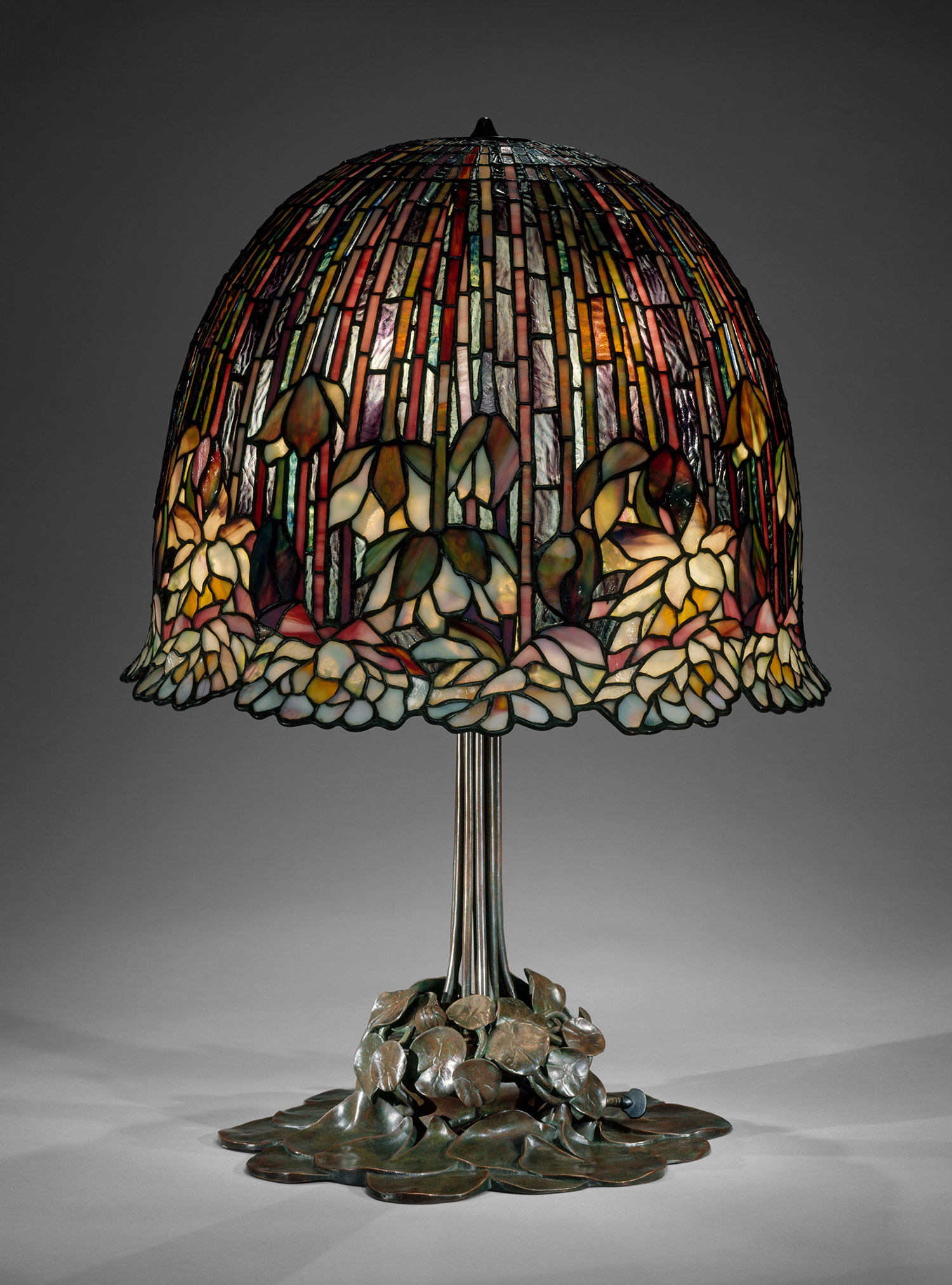
Louis Comfort Tiffany “Lamp” Source Date: 05/11/15
This piece is very interesting because it is in the form of a lamp unlike most of the other pieces of art I have researched which have been paintings or sculptures. It looks like the lamp contains lots of different shaped petals made from stained glass. Each of these segments of glass have been surrounded by lead to connect them to each other which creates a black border around each segment, this is a recurring theme in art deco.
Art Deco is an influential visual arts design style that first appeared in France just before World War I and began to spread internationally in the 1920s to 1940s before its popularity fell after World War II.
Charles Rennie Mackintosh “Stained Glass Window from The Hill House” Source Date: 05/11/15
This piece like the first is also stained glass much like most pieces of art deco work. This piece incorporates a lot of flowing and curved lines to create the composition. The background is a very pale colour which adds great contrast with the rose and makes it stand out more in the composition.
Josef’s work is very different to the previous two because it isn’t focused on stained glass, his work is focused more around chairs. This chair has a perfect line of symmetry down the centre. The chair also includes some geometric shapes such as circles. The red seat cushion has great contrast with the rest of the chair and this makes the feature very eye catching.
Post-Impressionism
Vincent Van Gogh “Starry Night” 1889 Source Date: 16/11/15
This is an iconic piece in the Post-Impressionism movement by Vincent Van Gogh. He has created surreal flowing patterns in the sky to signify how the clouds are blown in the wind. In a lot of his work he uses lots of bright colours and this is a key feature in the movement. Van Gogh has used light and lighting a lot in this piece as you can clearly see some sort of aura coming from the stars and the moon.
Post-Impressionism includes a wide range of distinct artistic styles that all share the common motivation of responding to the Impressionist movement. The key ideas include symbolic and higher personal meanings, dominant structure, order and the optical effects of colour and abstract form and pattern.
Georges Seurat “A Sunday Afternoon on the Island of La Grande Jatte” 1886 Source Date:16/11/15
This picture is very different to Van Gogh’s but it is still part of the Post-Impressionism movement. This picture almost looks like its has slightly been digitally blurred but it is merely the technique used to paint it. This composition includes a lot of bright colours and smooth lines. This is one of the similarities with the first piece. I’m not such a fan of this piece because I feel it looks a bit plain and there are too many points of focus.
I feel this piece is rather basic compared to the previous two but that may have been a design choice so I’m not sure if it’s fair to judge it in that way. The colours are smudged together so you can barely make out the difference between each piece of scenery, however, I do like the look of the mountain or hill in the background because there is a lot of contrast between that and the rest of the painting.
Futurism
Umberto Boccioni “Charge of the Lancers” 1915 Source Date: 17/11/15
This piece is part of the Futurism movement. This composition shows men riding horses with lances into battle. The main themes of Futurism are power and speed. The horses represent power and force in the image and the speed is shown by the dust being kicked up from the ground. The legs of the horses almost look as if they are trying to be animated but this picture is from an era before modern animation.
Futurism is an Italian avant-garde art movement that took speed, technology and modernity as its inspiration, Futurism portrayed the dynamic character of 20th century life, glorified war and the machine age, and favoured the growth of Fascism.
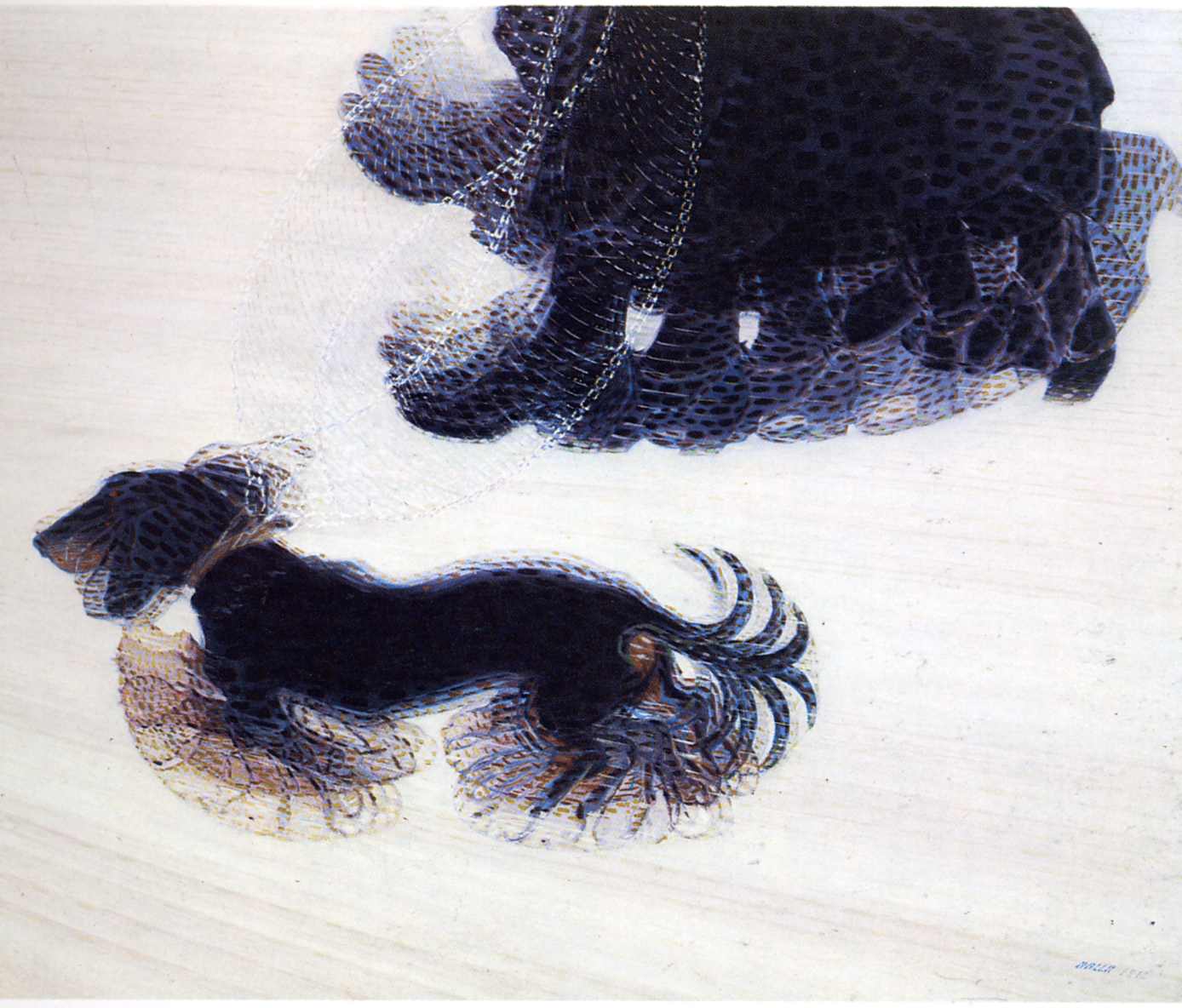
Giacomo Balla “Dynamism of a Dog on a Leash” 1912 Source Date: 17/11/15
This composition is more based around speed. As you can see all the moving parts of the dog and the dog walker are blurred and look like they are part of a walk or run cycle. The blurring on these limbs give the impression that the dog is moving at high speed. Dogs are usually symbolised as powerful animals so the dog could signify power in the composition.
German Expressionism
Ernst Barlach “The First Day” 1922 Source Date: 23/11/15
In this image it shows the creation of light with the man in the composition being God. Barlach was known to be mystic so Christianity and God were common themes in his work. This style of woodcut looks very similar to line art except there are large areas that have been shaded solid black.
German Expressionism refers to a number of creative movements beginning in Germany before the First World War that reached a peak in Berlin during the 1920s.
Still form the 1920 film “The Cabinet of Dr Caligari” Source Date: 23/11/15
This still from a film almost looks as if it has also taken inspiration from Surrealism with it’s slanted buildings and unrealistic lights. Like the first image this is also grayscale which is expected since colour film had not been invented in the 1920s. I like the look this still because it is very intriguing and odd, for example the way the light hits the ground in an almost star like pattern.
Käthe Kollwitz “The Parents” 1923 Source Date: 23/11/15
This composition shows the struggle parents had to face after losing their loved ones in the First World War. Kollwitz was moved after seeing some of Ernst Barlach’s woodcuts so decided to make some of her own depicting the tragedies of the War. The very rough nature of the lines in the woodcut help express the sorrow going through these two figures.
The text in the poster reads “1. You want to overcome cold? 2. You want to overcome hunger? 3. You want to eat? 4. You want to drink? Hasten to join shock brigades of exemplary labor!” An Agitprop poster is a form of propaganda used in 1920s Russia. They have used the colour red because red signifies Communism, also red is a very eye catching colour so it would attract attention to passers by when they saw the poster.
Constructivism was an artistic and architectural philosophy that originated in Russia beginning in 1919 and was a rejection of the idea of autonomous art. The art was mainly used for Communist propaganda.
El Lissitzky “Beat the Whites with a Red Wedge” 1919 Source Date:23/11/15
This was one of Lissitzky’s first attempts at propaganda art. The white circle represents the anti-Communist White Army and the red wedge represents the Red Army piercing their defences. I like the level on contrast between the colours of this composition since the red, white and black have a lot of contrast between each other. I also like the symbolism in the piece.
Vladimir Tatlin “Monument to the Third International” 1920 Source Date:23/11/15
This tower also known as “Tatlin Tower” was Vladimir Tatlin’s most famous work. It was going to be the central hub for functional conference spaces and a propaganda centre for the Communist party. This tower symbolized industry, technology and the machine age in Russia.
Conceptual Art
Joseph Beuys “Fat Chair” 1985 Source Date: 26/11/15
This is Beuys piece called “Fat Chair” given the name because the is a large wedge of animal fat on the chair. The animal fat is supposed to represent human life since humans are made up of a lot of fat. I feel this is an interesting depiction on human life because it is only representing us as a compound we are made of and has not been sculpted in any way to look like a human. I also like that this composition would change over time as the fat been to decay which means people viewed a different art piece every time the viewed it.
Conceptual art or Conceptualism is art in which the concepts or ideas involved in the work take precedence over traditional aesthetic and material concerns.
Sol Lewitt “Standing Open Structure Black” 1964 Source Date: 26/11/15
This piece of work reminds me a lot of the art movement Minimalism since the piece isn’t that complex and has very basic lines and form. I like the very bold nature of the beams in this sculpture and it looks like it would be a very rigid object.
Joseph Beuys “Homogenous Infiltration for Grand Piano” 1966 Source Date: 26/11/15
In this piece Joseph has wrapped a grand piano in grey felt. This felt is supposed to be some sort of bandage for the piano which makes it seem like the piano needs some kind of aid or help. The felt mutes the sound of the piano so it makes a completely different sound and this is supposed to make it less grand.
Surrealism
Salvador Dali “The Persistance of Memory” 1931 Source Date: 26/11/15
This is one of the most iconic pieces of art in the Surrealism movement. The clocks in the image depict mortality and how time is slowly melting away. Salvador Dali also had a fascination with ants and flies to signify decay of life. I like this picture because it is very peculiar and the meaning can be different for lots of different people.
Surrealism is a cultural movement that began in the early 1920s and is best know for its visual artworks and writings. The aim was to resolve the previously contradictory conditions of dream and reality.”
The object in the centre is some sort of mechanical elephant-like being. This elephant thing was based on a photograph of a Sudanese bin for storing corn. I don’t really understand what the composition represents but I still find it interesting to look at, for example, why is there a headless women in the foreground. This picture has a very surreal feel to it because it is an imaginary and dream inspired image.
In this composition there elements from different movements such as Cubism and Primitivism. This is painting of the farm that Joan lived on for most of his life and spent 9 months painting. I like the deep orange and red colours in this painting which almost give it an Aboriginal feel to it.
Young British Artists (YBA)
Damien Hurst “The Physical Impossibility of Death in the Mind of Someone Living” 1991 Source Date: 27/11/15
This is one of the most well known pieces of art in the Young British Artists movement by Britain’s wealthiest artist, Damien Hurst. The sculpture is a tiger shark that is suspended in a formaldehyde solution. This piece shows that we don’t understand death until we are dead ourselves. I like this composition because it is very bold and striking.
The Young British Artists movement is the name given to a loose group of visual artists who began to exhibit together in London in 1988. Many of the artists graduated from the BA Fine Art course at Goldsmiths, in the late 1980s.
Sarah Lucas “Au Naturel” 1994 Source Date: 27/11/15
I believe this piece represents a man and a women lying in bed together with their genitalia represented as objects. The title “Au Naturel” implies that this is just the bare bones of gender by just showing the genitals of the body. I find the way Sarah has depicted relationships is quite humorous.
Rachel Whiteread “Mausoleum Under Construction” 1992 Source Date: 27/11/15
This piece is fairly different compared to the previous two, it isn’t as interesting or as striking as the others, it just seems eerily empty. There is a good amount of symmetry in this composition but there isn’t very much contrast. I don’t really like this image because I feel it’s a bit boring.
Dada
Francis Picabia “Portrait de Mistinguett” 1907 Source Date: 27/11/15
The range of colours used in this piece are mainly beige and white and a few places of vibrant colour like the hat for example. I don’t find this painting very interesting because it just looks like a women wearing a hat and I can’t seem to work out any deeper meaning to the painting.
Dada was an artistic and literary movement that began in 1916 in Zurich, Switzerland. It was a reaction to World War I, and the nationalism and rationalism which many thought had brought war about.
This piece was one of the most influential artworks of the 20th century. Although it is just a ceramic urinal on its side, it was actually just an elaborate prank poking fun at American avant-garde art. I find this funny because it just goes to show that anything can be art.
Man Ray “Le Violin d’Ingres (The Violin of Ingres)” 1924 Source Date: 27/11/15
This is an interesting piece depicting a women’s body as a violin as the curves of her back follow those of a violin. This picture almost looks as if the F-holes have been Photoshopped in but they have actually been painted on.
Personal space is considered to be an imaginary concept but Snibbe wanted to make to express it visually. “By projecting the diagram, the invisible relationships between individuals and the space between them become visible and dynamic.” (Scott Snibbe – Interactive art, 2016). Snibbe’s creation could be considered a blank slate when the platform is empty but it requires human interaction for the artwork to come to life. Two people need to be standing on the square at once for the line to appear between them. “In this way Boundary Functions is a reversal of the lonely self-reflection of virtual reality, or the frustration of virtual communities: here is a virtual space that can only exist with more than one person, in physical space.” (Scott Snibbe – Interactive art, 2016).
Blow Up is a piece that scales up a breath into the small fans and projects that breath via the larger fans in the room. With this piece Snibbe wanted to discover what separates a breath from the rest of the air, “Yet what distinguishes ”my breath“ from mere air and, further, what distinguishes my breath from me?” (Scott Snibbe – Interactive art, 2016).
In Scott’s work he seems to take a simple interaction, whether that be a breath or just a step, and then manipulates it to create some thing else whilst keeping the process very simple and easy to understand visually. He also seems to use the principle of cause and effect in his pieces.
rAndom International
Rain Room
“Rain Room is an environment of falling water through which it is possible to walk, trusting that a path can be navigated, without being drenched in the process.” (International, 2016).
I’m starting to see some trends in the way most interactive art installations are created, they seem to be fairly dull or lifeless without human interaction but when people interact with them they seem to come to life and react with the user. This could be something I consider using when making my interactive piece. I really like the idea of this installation because it takes the concept of rain and reverses it.
Mirrors
The aims of this installation was to redefine the meaning behind the word “pixel”, as the artist says “‘Mirrors” aims to re-interpret the meaning of the word ‘pixel’. Rather than taking the form of a tight grid, typical for the flat, orderly display of information, each individual ‘pixel’ has been given the distinct freedom and ability to move around in a three dimensional space, at its own discretion.” (International, 2016). When I first looked at this piece I thought the mirrors moved in a motion similar to that of a wave or flowing water and that the mirrors represent the reflection of that surface.
This installation is a set of hanging vibration motors that are triggered by the users movement that makes the entire installation rattle. The artist says that “Sound is one of our most effective ways of sending and processing signals. By generating sound in response to movement What It Isn’t generates life around viewers.” (International, 2016). This shows that interactive art doesn’t always have to be visual but instead it could rely on one of the different senses such as sound, touch or even smell (I’m not too sure how I would apply smell to my piece but it could be something I consider).
References
Scott Snibbe – Interactive art. (2016). Bio. [online] Available at: http://www.snibbe.com/bio/ [Accessed 12 Jun. 2016].
For this brief I think I will be making some sort of drawing experience probably using the software Processing because I have a decent amount of knowledge in using the the software.
Producing Outcome
So I started working on my idea for a drawing experience.
After a few prompts online I found a basic way of creating a basic drawing system now I need to start adding some more interesting features to my idea. The lines of code I used are shown above.
After some experimenting with trying to manipulate the x and y values of the drawing system so I think I will be changing this and try something different.
So I’ve decided to take a different approach to this task. Instead of a drawing game I will be making a game that shows how people are repel from each other, the people being different shapes.
Here is the code used to make the blue square move in four directions.
I decided to surround the square with eight circles so that it formed a grid like pattern. This pattern represents the order in society and much like the other pieces of interactive art I studied it means nothing until it is interacted with. When the player starts moving the blue square around you notice that the orange circles repel from the square when they get within a certain proximity. I feel this feature represents how certain people can be isolated just because they are different, in this case that would be the blue square being different from the orange circles.
In this task we had to draw using unusual techniques such as not looking at the paper, holding the pencil in a fist while drawing, drawing with you non dominant hand and a few others. These techniques made me think about the drawing much more than I usually do since most of the time I draw from memory. This task also produced some interesting styles of drawing such as the one where we couldn’t look at the paper which came out as an abstract piece of art. I feel I could use these skills in the future when drawing to produce a different style to my usual style of drawing.
Workshop 2: Perspective
For our first task we had to draw a kitchen and then a hallway with one point perspective. One point perspective is when the image has one vanishing point and every line excluding vertical ones points towards the vanishing point. I found this task fairly easy since I have used one point perspective many times before.
The second task was to draw a house using two point perspective. Unlike the first task this is when the picture has two vanishing points. This was slightly harder than the first task because I have not done this before but I was quick to pick it up and understand the concept but I feel I need some more practice on it.
Workshop 3: Construction Drawing
This week we were focusing on construction drawings. Our main task was to draw a variety of standard objects arranged in a random way on the table.
This drawing was our first one in which we used pencil and were advised not to use the rubber and keep all our construction lines. I made a few mistakes on this because it was hard to get the correct scale and measurements of and between the objects. I also had a few problems with the perspective of the objects.
The second drawing was a charcoal one from a different angle. This was a more fluid drawing and we used the edge of the charcoal to create effective straight lines. I was also able to smudge the charcoal to hide some imperfections in the drawing.
Workshop 4: Negative and Positive Shapes
This week we had to draw negative and positive shapes. To achieve this we were given the task to draw an arrangement of objects such as tape, a pencil and some wires. This was a fairly difficult task because there was so many components and they had interesting relationships with each other. I also made the mistake of drawing the image slightly tilted up but I got the perspective correct which was still good. Overall I feel drawing negative space is an effective way of drawing lots of objects together and I feel I will use this in the future.
Workshop 5: Drawing the Human Form
For this task we had to draw the human form quickly by drawing the basic lines in the body, i.e the spine, head, arms and legs. I used the website Pixelovely for reference images. I found this task fair simple since I have done this type of drawing many times before.
For the second task we had to flesh out the drawings to make them more like people and less like skeletons. I also found this task fairly simple because I have done a lot of work on the human form. This is a useful skill to have because I feel I will use it in the future.
Workshop 6: Drawing Heads and Hands
In this task we had to draw a profile view of the person next to us and make sure we take into account the proportions of the face. I found this task fairly easy because I have done a lot of this before.
In the second task we had to draw a portrait view of the same person. This task I found slightly harder because I had to make sure both halves of the face looked right. I didn’t draw all the hair because that isn’t really an important part of the face.
For these tasks we had to draw faces at different angles. This task was fairly hard because I haven’t had much practice doing this and I feel it’s a skill I need to practice on.
This was the last task on faces. For this task we had to draw some more faces from our imagination. I found this task fairly simple and I don’t think I need anymore practice with this.
This task was to draw hands. We had to draw a skeleton of them and then flesh them out. I found tis slightly tricky since it was new to me.
Research
Concept art is a form of illustration used to convey an idea used usually for film, animation or video games for example.
This piece of concept art is based in a fantasy world much like many other pieces of concept art since the character in this painting is not realistic since she has elf ears. This was mostly likely created using digital means to create it. The artist has a good use of layers since has got some plants in the foreground the character in the middle and some more plants in the background as scenery.
Ross Tran has created a piece of concept art that is also set in a fantasy themed world. The picture seems to be set on an imaginary planet and the creature next to the women is also fictional. This piece of art also seems to be created using digital means such as Photoshop. The is a great sense of isolation with these two characters since they seem to be alone on this planet. The image has a strong focus on the centre of the image because the bottom of the half the image seems to be slightly blurred.
Hand Drawn Concept Art by kkfreak Source Date: 02/11/15
Here is a hand drawn landscape which looks as if it was drawn in pencil but I’m not entirely sure. If this sketch was to be developed colour would probably be added. I like this style of concept art because is very basic and barebones and it is not covered in fancy visuals. This piece also looks like its set in a futuristic scene/environment.
The scenery for my story will be set in a futuristic city that has been destroyed and covered in foliage such as vines, bushes and grass for example. I will use features of these cities and include them into the scenery.
Here is a futuristic car. I will use this car and images like this for reference in my concept art, however I will make these cars look destroyed and broken to fit in with the apocalypse setting of my story.
Here are some surveillance drones and objects used for surveillance in my city setting. This piece above is from the game Half Life 2 and I will probably use it as a reference for designing futuristic objects and equipment.
Here are a few character sketches. The character on the left will be the main character. He is an ex police officer. The character on the right is one of the robots that have taken over the world.
Here are a few examples of possible environments for the concept art.
Here are some basic concepts for vehicles and surveillance drones before the apocalypse. The actual cars and drones will be weathered and damaged.
Ideas Development
People
This image shows the development of the main characters face. The images on the top row show potential faces for the main character. On the row below I have taken the features I liked from the top row and combined them to make the main characters face.
Here are different body type examples of the main character. I think the body type in the middle will fit the main character since its not too muscular or too slim.
Produce Outcome
People
I used this sketch and created some basic shapes over it in Illustrator using the pen tool to create a basic outline.
Here is the basic outline of the front view of the face.
Here is the front view of the face with facial features. I made the shapes of the facial features by adding and subtracting shapes together.
Here is the side view of the face with a basic outline. I aligned the features of the left face with the right face by using guides on Illustrator.
Here is the final piece of the people concept art section. I decided to make a piece of the character before the apocalypse. I made this in Illustrator.
Environment
Here is the main construction lines of my environment study. I decided to go for a two point perspective view because I felt it was more interesting than just a one point perspective view.
On this step I removed the construction lines and added doors to the buildings.
In this step I added more detail to the buildings in the scene.
In this step I finished adding detail to all the buildings.
In this step I started adding destruction and weathering to the buildings.
This is the final piece (If you want to see the image in more detail refer to the original). I finished it up by adding some destruction to the road and pavement and finished adding vines and smoke to the buildings.
Objects
First I started with a few basic shapes in Illustrator and then added them or subtracted them from each other to create these three shapes of my futuristic surveillance drone.
I then duplicated the black shape, made it smaller and the moved it to the left and then repeated this until I had this.
I then added antennas to the drone.
Next I added an eye-shaped camera to the front of the drone.
I then added a button to the side of the drone.
Next I added the correct colours to the drone. This was fairly simple in Illustrator because you can easily change the colour of the shapes once they are created.
Here is the final piece. I made the front view by aligning it with the side view and creating guides in Illustrator.
Final Evaluation
People Evaluation
I feel I completed this piece of concept art fairly well and it came out the way I had intended it to be. I like that the image is very sharp and bold, this is due to using Illustrator to create this composition. I also liked my use of bright colours to contrast the black of the visor and the characters skin tone.
However, if I was to do this piece again I would work more on making the jaw of the character more symmetrical and I would also create the rest of the body for the character as just creating the head is kind of limiting.
Environment Evaluation
(Please refer to the actual drawing instead of this picture since the quality of my camera doesn’t do it justice)
This piece I am most proud of out of the three pieces of concept art because I enjoy drawing perspective drawing so it was an enjoyable though tedious at times process. I like the level of detail I used when creating this picture like the vines and smoke coming from the buildings.
If I was to do this drawing again I would have added more detail into the pavement and road area because I feel it is fairly bland compared to the rest of the drawing.
Object Evaluation
I like the futuristic design of this object, the surveillance drone, because it is simple in it’s design and in the same style as the people study since I used Illustrator to design both pieces.
If I was to create this again I would add more detail to the design of this drone such as circuitry and wires. I would also like to create a version to show what it looks like after the apocalypse.
Workshop 1
Thumbnail Development
In this workshop we were given the task of creating many different thumbnails for a campaign which would encourage people to vote. The slogan of this campaign was “I give an X” so the logo had be an X. Creating a thumbnail is where you draw lots of small images quickly and then you can choose a few of the thumbnails to develop into a final design. This is a good method for coming up with lots of ideas quickly.
Workshop 2
Zombie Apocalypse T-shirt Design
In this task we were challenged to make a zombie apocalypse t shirt design for Redbubble but we were only allowed to use rectangles, triangles and circles in Adobe Illustrator. This was rather difficult because I was not familiar with the software and it was made even more difficult constrained to these 3 shapes.
Workshop 3
Design Principle: Similarity
Original Image
Finished Image
For this task we were given an array of boring shapes all coloured grey scattered around a page and we had to rearrange, resize and add colour to them to make them into something more aesthetically pleasing. I decided to arrange my squares and triangles to look like rows of houses which direct the viewers eyes towards the sun which is the centre piece of the design. I also incorporated a lot of symmetry in the design because I felt it gave more order to the piece and I had the right amount of shapes to achieve this. I also chose bright looking colours to catch the attention of the viewer but it also creates contrast between the white space.
High contrast T-shirt
For this task we had to create another T-shirt for this one I decided contrast would be my key feature so I decided to go for the two most contrasting colours white and black. I arranged them in a spiralling way to create a spinning motion.
Workshop 4
Design Principle: Rhythm
There are three types main types of visual rhythm: Regular, Flowing and Progressive
Regular
All of these images are good examples of regular rhythm because they all have a regular pattern and the spaces between each line or row are the same distance apart and same size. The patterns also repeat in a predictable way and have a linear path. Although the first image doesn’t look regular that is because the object is curved so the edges look smaller than the foreground.
Flowing
These rhythms are all flowing because the patterns are organic and flowing. The intervals between each line are individual and unique which makes them a flowing rhythm.
Progressive
These images have a progressive rhythm because they repeat in with intervals that reduce or increase in size. The intervals could also change in colour or gradient.
Regular Rhythm Composition
This is my regular rhythm composition. I decided to keep this composition simple with the colours and the design. I made sure the sizes of all the lines are all exactly the same and the distances between them are all identical. I feel I could improve this design by adding more colours and maybe more lines.
Flowing Rhythm Composition
Here is my flowing rhythm composition. For this composition I decided to create a high level of contrast while sticking to the flowing rhythm. If I was to do this task again I would make the design far more complicated and add more flowing lines.
Progressive Rhythm Composition
Here is my composition for progressive rhythm. I decided to keep this design fairly simple like my previous ones. I made sure the rectangles direct your eyes towards the centre one by making them progressively smaller. I also kept the shades of the colours fair similar so the viewer doesn’t get distracted by one of the squares. I also made sure the intervals between the shapes were slightly different. If I was to do this again I would add more complexity in the design while keeping it’s progressive rhythm.
Workshop 5
C.R.A.P
This first piece has good alignment since the the main text and logo are aligned to the centre and the text at the top is also aligned to the top. The contrast on this piece is good, however the white text slightly blends into the snow on the mountains. There isn’t a strong sense of repetition in this piece because a lot of the elements on this composition are different. The proximity of the piece is good because the text is close together but well spaced.
The contrast in this piece is very good because white on black has the highest level of contrast. There is no repetition in this piece at all. The alignment is slightly offset on the text and the proximity is almost not included.
There is not much contrast in this piece because it is very chaotic and hard to read. There is a lot of repetition but it is not regular and does not follow a pattern its more of a cluster of text. There is barely any alignment apart from the red text being aligned to the left and the speech mark being aligned to the border and there is a very low proximity between words in the cluster of text.
For this task we had to apply the principles of C.R.A.P and apply it to make a image out of the resources we were given. These resources were a picture, a quote, a title and his name. I decided to mask over his face and make it red to create a bold image and make it contrast from the background. I decided to place the text over the mask and shape the text with the image. I also aligned the text on the right with each other to make it look more aesthetically pleasing.
I feel I have improved the result of the website dramatically since the website I chose was so poor to begin with I couldn’t make it look any worse. I have used alignment to align the text down the centre and I have also aligned the dogs to each other.
Workshop 6
Design Principle: Texture
What is the Difference Between 2D and 3D Texture?
2D textures use more visual forms of texture whereas 3D textures use more tactile means to display texture.
What is the Difference Between Visual and Tactile Texture?
Tactile texture is when you can actually feel the texture whereas visual texture is just the illusion of the surfaces texture.
What is a Motif?
A motif is any recurring element or repeated figure in design.
This is the result of me creating a seamless texture from an existing image using a tutorial. This was a very tedious task to do without creating blurring on the image but a very useful thing to know.
Here is my attempt at making a pattern out of some of my rhythm work from a previous task. I found this fairly easy because my design was fairly basic to begin with so I didn’t have to edit the pattern much.
For this task I had to create a website header using the phrase “If you can’t open it, you don’t own it” incorporating different textures. I used two different rock textures for this and created a shape using the lasso tool around the text then filled it with the rock texture. If I was to do this task again I would have to find a way to add texture to the text itself.
Design Principle: Hierarchy
For this task we had to create an example of a web page for a client. I decided for a very simplistic approach to the task and I aligned the pictures and text. I decided to centre align the text and aligned the pictures horizontally with each other. If I was to change this I would reduce the size of the logo and maybe not make it the centre piece of the design.
Wire Framing
For this task we had to create a wire frame for a website for a client. I found this task fairly easy because it didn’t involve very complex design work. I made sure a lot of the design was aligned with each other so it looked aesthetically pleasing. This time when designing the website I made sure the logo wasn’t too large on the document.
Research
The design of this app is very simplistic. The entire app revolves around the ability of using a map to find street food near your location. This makes the experience very user friendly and ease to access especially for those with little knowledge of the app. If you don’t want to use the map to find street food you can use the list or search bar to find street food. This app heavily relies on the GPS feature in smart phones, this makes it easy to find your location without any user input, however, this makes it difficult to find your location if you do not have a GPS in your phone because there is no way to manually input your location. The buttons and menus of this app are very minimal and the whole app only consists of white, black and grey which creates a lot of contrast between the text and background. This is good for viewing the app under bright light because the text is clear to read, however the white maybe too bright for people using the app at night.
This app follows a fairly similar formula as the first, that being that the main feature is the map showing where the street food vendors are located. This app has a black header containing two buttons, one of which brings up the map and the latter brings up a list of the street food vendors. The list tab is broken up into four subsections: Nearby, A-Z, Popular and Faves. When the user clicks on their desired vendor it brings up more information about the vendor such as location.
Here is the website for Deliveroo, a delivery service that delivers food to people from restaurants or chains that don’t usually do take out. The website gets you straight to the key idea of the service which is delivering food, as you can see that you are asked to type in your postcode straight away. This method prevents confusion and allows for quick and easy ordering. Also the large picture of food on the front page makes you hungry and more likely to order from them. There is high contrast between the white title and the dark picture which makes the title easy to read. There is also a section to learn more about the service but the information is hidden at first glance so there isn’t too much text to read.
I feel this is a very effective layout because it keeps the information concise and easy to read while it gives you the option to do in-depth if you want to.
This website is for several different food products such as sauces or recipes. This website is very eye catching with its large central image that is on a slideshow so it changes through a list of images so you’re less likely to get bored of the image you’re viewing. The white header displays buttons for products, the logo, the branding and buttons for social media. I like this style of website because it has very few words unless you go deeper into the website to find more information.
This website has a more casual feel to it compared to the other examples but this could be more inviting to a formal styled and some people may find it easier to access. This website incorporates images on the buttons which allows users to see what they are clicking on before the click it. This site also uses a lot of images to display information, this seems like a common theme in web design when it has something to do with food.
Here is the mobile app for the McDonald’s app. The app has a red header at the top of the app which stays throughout every page or screen of the app. There is also a menu that pops up from the left and slides across to reveal more options or services within the app. This app also has a map of where the restaurants are. This seems to be a common theme in these food apps so it is something I must take into consider when designing my app/website.
This is the app for Food.com which is used for finding out new recipes. This app makes it easier to find the recipe you want quickly and successfully by showing you the key information, such as the time it takes to make and the popularity of the dish, before you click on the recipe. This allows for quick and easy browsing.
Proposal
Project Proposal
BTEC Interactive Design
BTEC Level 3 BTEC 90 Credit Diploma in Art and Design (Interactive Media)
BTEC Level 3 BTEC Extended Diploma in Art and Design (Interactive Media)
Learner Name: Owen
Specialist Area: Interactive Design
Date: 7/12/15
Section 1
Working title: Street Food Website/App
Target Market
People young and old who have a busy lifestyle and they like sampling lots of different cuisine.
What you will work towards producing: (Detailed description of your proposal)
I will be designing a website and app for finding street food in your local area using geo-tagging tech features. It will also allow vendor to add their menus and information, will allow consumers to rate food and service and will allow consumers to share photos of both the food and vendor.
Section 2
Influences, starting points and contextual references:
I will be influenced by current website and app designs for food websites and apps.
Early ideas research and sources: (What are your sources for contextual and personal research?)
I have researched other websites and apps in the same field.
Section 3
Intended techniques, non digital and digital processes:
I will sketch ideas for logos and possible layouts for the website/app on paper and will also make several paper prototypes of the website and app.
I will then take these hand drawn pieces and bring them into Photoshop or Illustrator to develop them digitally. Also the final outcome will be digital.
Timescales: (Please insert weekly targets of what you intend to work on from the beginning to the end of the project)
Week 1: Research
Week 2: Research
Week 3: Finish research and create proposal
Week 4: Generate ideas
Week 5: Develop ideas
Week 6: Produce outcome
Week 7: Produce outcome
Week 8: Evaluate
Week 9: Present work
Section 4
Proposed methods of evaluation: (How will you evaluate your project?)
I will self evaluate my work and I will get critique from others in the class.
Ideas Generation
First I started by coming up with some possible names for the company. I did this by looking up some different ways of saying food in a thesaurus and playing around with different ideas. I feel the name “Street G’nosh” fits best with the company since it incorporates both street and food, plus it sound good.
I think I will be changing this name to “Street Nosh” because it is easier to understand and easier to spell.
Ideas Development
Here is a mind map that i made of features of the app that helped me visualise some ideas for features of the app.
Paper Prototype
Here is the paper prototype for the mobile app.
Wireframe
Here is the wireframe for the app. Throughout the design of this app I made sure that the user knows which page they are on by highlighting the buttons when they are clicked on.
When using the keyboard for this page I realised that the user wouldn’t be able to see the search bar when the keyboard appears so I had to move it up with the keyboard.
Here is the login page so the user is able to login into the app.
I used this image of a Chinese take away box, also known as an Oyster Pail and used is as a basis of my logo design.
I then traced the outline of the box with the line tool in Illustrator and created a red background behind the lines to make the white stand out. I think I will be using these colours for my theme for my app.
Produce Outcome
Here is the header for the app. I decided to follow the colour scheme of the logo/app icon and apply it to the app. I am currently undecided on the font and the colour of the font.
I added a map that will show the location of local street food.
I added the search bar so that the user can search for their location instead of manually trying to find it. I made a search bar icon so the search bar can be recognised easily.
I decided to get rid of the large “Find Location” button at the bottom of the screen because I felt it was taking up too much space. Instead I decided to reduce the width of the search bar and make an icon for the find location or location services button. I feel this works well because it allows more space for the map.
I have decided the app’s rating system will work similarly to that of reddit.com, where the post with the most upvotes will gain the most attention and move higher up the ratings compared to those with less upvotes. However, I have noticed that the icons for rating the vendor will be too small to click successfully for those using the app so I will have to think of a different way to rate the vendor.
I decided to replace the upvote system with a system which relies on likes and dislikes to rate the vendors.
I added the rest of the example vendors and I also removed the black outline around the list and the add location button because I felt they were not needed. I also rounded the corners of the add location button to make it match the top rated and new submissions button.
Here is the new submissions list. It is very similar to the top rated page except it has different vendors on the list depending on how highly rated the vendor is. I need to add a system which allows the user to see what rating the vendor has.
I added a like/dislike bar to represent how many likes/dislikes the vendor has got.
I only made a few adjustments to these pages such as replacing the alternative login options with the actual icons and making the buttons at the bottom match the others on the rest of the app.
Here is the page that becomes unlocked when the users login. I need to include a system that allows the user to favourite their favourite vendors.
I added a system that allows the user to add vendors to their favourites. The icon turns red when it has been activated.
Here is the page that allows the user or vendor to add their street food to the app.
I added a keyboard to all the pages that needed some sort of typed input.
Here is the final design for the app.
Here is the android phone version of the app.
Here is the iPad version.
Here is the android tablet version of the app.
Here is the desktop website.
Final Evaluation
Overall I found this task rather difficult because I found it hard coming up with ideas, however, after going through the research stage this filled me with confidence and a lot more ideas which made coming up with ideas a lot easier. I took inspiration from many apps and saw that the common theme with these apps was that the map was the main feature so I decided to make that the key feature of my app. Another hurdle I faced was coming up with a company/app name. To make this process easier I decided to do some word association where I took the words “street” and “food” and found alternative ways of saying them.
The final product from this project came out as I intended it to and I feel it looks professional and fits in with other apps of it’s nature.
If I was develop the app further I would probably spent more time adding information to each individual vendor such as information like location and how it could be seen on their profile.
“The app is self explanatory and seems easy to use and navigate”
This was one of my key ideas when designing the app. I wanted to make sure ease of use was my main priority like it is with many apps currently on the market. I wanted to make the app simple or basic so this would minimise confusion.
In this workshop the task was to create a stop frame animation using analog (not digital) means, which involved taking photos of about 50 small drawings.
The task in hand was very tedious because i had to draw lots of the same images by hand so it was extremely hard to keep those images consistant and similar. Also I didn’t have a camera I could use so I had to use the webcam on the computer to capture my work.
If I was to repeat the task I would have scanned the images for better image quality and even lighting and scale on all of the frames. To make the task more enjoyable I would have probably completed it through digital means (using a graphics tablet) since I would be able to make use of handy features on Photoshop such as layers, scaling and duplicating. In addition Photoshop would make it easier to add colour to the frames without it taking up to much time and would remove the fear of messing up my work.
Attempt 2
This is my second attempt at making a gif using stop frame animation but this time I only used digital means (Photoshop) to create the animation. I feel this created a much smoother and polished outcome compared to the hand drawn gif because I was able to create a zooming effect far easier than I would be able to by hand. However I had slight problems with the quality of the image when scaling it up but it wasn’t too much of a problem. Overall I think I have improved a lot since my previous attempt and I will try to use this technique in the future.
Week 2
Workshop: Storyboarding and Animatics
In this work shop we had to make a storyboard and then make that into an animatic from an old folk tale. In our case we decided to go for the folk tale “The Magic Paintbrush”. First of all we had to summarise the folk tale into key points and then we had to use those key points to make the storyboard, each point made one scene for the storyboard. Overall I think our storyboard went well although we were working in pairs so that resulted in our drawing styles being slightly different but we decided to go for a simple style (silhouettes for characters) so this wouldn’t be such a problem.
For our animatic, we put the scanned images into Photoshop and did some light editing to get them lined up correctly. This worked well and came out quite while. We also added an ending slide to show when the gif ends because the looping nature of a gif may have made it difficult to notice when the story ends and begins. If I was to make this again I would trace over the images in Photoshop to make the lines more defined and add colour to the gif.
Here is the the updated version of the animatic. In this version I decided to sharpen up the visuals and make the lines cleaner. I managed this by drawing over the lines in Photoshop on my graphics tablet and I feel it looks far better than the original. This technique also compliments the silhouette style of the animatic. Overall I think this has improved the animatic significantly.
Week 3
Workshop: Walk Cycles
In this task we had to make a basic walk cycle using an example of walk cycles by Preston Blair. I decided to go for the basic walk however it was only a half loop of a walk cycle. I feel this turned out fairly well but I had a few problems with keeping the same size of the character which I feel would be fixed if i used digital means.
On this second cycle I decided to go fully digital and use Photoshop and my graphics tablet to create this animation. We had to do a different cycle to the first so I decided to make my character walk with a cane which was much harder than the first because there was more components to animate. I feel this one worked much better than the first because it was a full walk cycle that loops whereas the first one was just a half loop.
On the final task we had to use Flash to make an animation cycle. For this one I decided to do the animation of my character diving off a diving board. I was not so familiar with Flash to begin with so it took quite a bit of learning before I had the basics down. I feel this gif came out rather well and I feel I may use Flash in the future rather than Photoshop because it is much easier with the tween tool since in Photoshop you have to drawn each frame which is rather time consuming, however the Photoshop method produces a more hand drawn aesthetic.
Week 4
Workshop: Bouncing Ball
For this animation we had to create a ball bouncing across the screen using motion tween in Flash. This was a fairly simple task but it helped us understand the motion tween tool and how to create smooth animations using this technique. The result of this technique results in a more computer animated style of animation compared to stop frame animation however it is much easier to animate using motion tween compared to Photoshop.
Workshop: Facial Expressions
For this workshop we had to take pictures of ourselves making different facial expressions and then animate them. I did this by using Photo Booth to capture my expressions and then I used Photoshop to draw over them and then animate them. For this first attempt I decided to just use each photo as each frame but for the next animation I will try to make the transitions between frames smoother and more fluid.
For this second attempt on facial animations I decided to make the frames smoothly move from one to another. To achieve this I drew multiple frames between the existing ones to morph the features to the next expression. I feel this came out quite well and I like that the features move around a lot due to the imperfections on my drawings.
Workshop: Lip Sync
For this task we had to practise lip syncing. I decided to use a well known YouTubers intro and animate it myself. Apart from a few issues with Flash exporting which resulted in some artifacting on the mouth of the animation, I feel the result was quite good although the process was very time consuming. I feel this will be very useful for the final brief.
Games Inspired by Art Movements
Minimalism
Mini Metro
German Impressionism
Limbo
Surrealism
Monument Valley
Drawing People in Motion
For this task we had to draw people in motion while on the way home. I couldn’t do this so I just got stills from a music video and drew them instead.
Research
Techniques and Developments of 2D Character Animation
Date: 13/10/15
This is an example of hand drawn animation using a flip book to animate the frames. As you flip through the flip book the pages give the effect that the animation is actually moving when in fact it is just lots of hand drawn frames. This technique gives a very raw finish and is very time consuming to draw each individual frame on paper since you don’t have digital aids to assist you. I don’t think I will be using this technique because it is far too time consuming and would be very difficult to use when building a level with lots of different components all moving individually. Hand drawn animation is better if you’re only animating a few things at a time but its not very good for very complex animations unless you want to invest a lot of time in the animation. For these reason I probably wont be using this technique.
Date: 13/10/15
This technique is stop frame/stop motion animation where to create the animation you have to take lots of photos or make lots of frames to construct the animation. This technique is fairly difficult to create a smooth animation but some people like that the animation has it’s imperfections. Although in this animation they used plasticine/clay to animate, stop frame animation can also be done via digital means to get the same stop frame effect. I have used Photoshop before to create stop frame animation and it was pretty successful although it does take quite a long time to get an animation to look good. I may consider using stop frame animation for my final animation but I will have to compare it to other animation techniques before deciding.
Date: 13/10/15
This technique is cut-out animation which is a type of stop-motion animation using flat characters, props and backgrounds made from paper or card. Each frame of the animation is usually captured by camera and then the pieces of paper are slightly moved and then another picture is taken to create the next frame and then this process is repeated to create the animation. This process can be very time consuming but the end product has a handmade aesthetic. I don’t think this type of animation will work for my brief because it will get far too complicated to animate on paper.
Date: 13/10/15
This technique is tweening animation which is made through digital means usually using a software like Flash. Tweening is the process of generating intermediate frames between two images to give the appearance that the first image evolves smoothly into the second image. This is very effective for creating smooth animations. It is also far more efficient and quicker to create animations that other methods because you don’t have to manually draw all the frames you just have to get the starting point and the ending point and then the software fills in the rest. I feel I will use this for my final animation because it will create a smooth animation and will fit well with the Minimalist movement.
Soundtracks and Sound Effects
Date: 13/10/15
This soundtrack from Fez is ambient music which would be good for a Minimalist style game. The music is very repetitive much like the art movement. The only draw back to this soundtrack or a soundtrack like this is that this music is designed for an 8-bit/pixel art game whereas mine won’t be like that.
Date: 14/10/15
This soundtrack is from the 2D platformer VVVVVV. This sound track uses a lot of repetition because it’s a game where you have to repeat sections of it lots of times from dying often. A soundtrack like this would be good for my game however the music has an 8-bit feel and I am maker a vector game so it might not match up.
Date: 14/10/15
A song like this would be ideal for my game because its ambient but it is also progressive. It would be great for a minimalist game because the beat is very simple and flowing.
Date: 14/10/15
A song like this would be good for my game because it is very slow and methodical. My game would be a puzzle platformer so a song like this would help capture the mood and atmosphere of the game.
Art Movement: Minimalism
Frank Stella “Harran II” 1967 Source Date: 28/09/15
I have decided to go with Minimalism because I am fairly familiar with the concept and I feel it will work well in a 2D platformer. The picture above is an example of Minimalism and as you can see the main features of this piece are bold colours and simple shapes. I feel for my game animation I could make the character very basic and only made up from a couple of colours and no textures. As you can see in Stella’s work he has added a white outline. I am not sure whether to include an outline or not, the outline adds more contrast and definition between shapes but I feel it make the shapes or characters start to look a bit more like Pop Art if the outline is black. I will experiment with this later on in the development stages.
These piece shares similar properties with the first in that it has bold colours and simple shapes. This piece also uses repetition and alignment in the composition. These are other key features of Minimalism that I will have to consider when making this game animation, for example I could make sure the platforms in the level align with each other or there could be repetition used in the background or the soundtrack. This piece also shows that white space is incorporated in Minimalism too so I should also make an effort to include this in my final animation. This could be in the form of a blank background or a lot of empty areas in the level.
Dan Flavin has used light and shadow in this piece while still keep it very minimal and in line with the Minimalist movement. For my game animation I may consider adding shadows and light into it but that may make the game look too complex and start moving away from the Minimalism movement.
Proposal
Project Proposal
BTEC Interactive Design
BTEC Level 3 BTEC 90 Credit Diploma in Art and Design ( Interactive Media)
Learner Name: Owen
Specialist Area: Interactive Design
Date: 14/10/15
Section 1
Working title: Above and Below
What you will work towards producing: (Detailed description of your proposal)
I will be producing a 2D animation of a game inspired by Minimalism.
Section 2
Influences, starting points and contextual references:
Minimalism
Early ideas research and sources: (What are your sources for contextual and personal research?)
I have looked at a lot of different Minimalist artists such as Frank Stella and Donald Judd.
Section 3
Intended techniques, non digitial and digital processes:
I plan to sketch up the ideas on paper and then redraw them using either Illustrator or Flash and then animate them on Flash.
Timescales: (Please insert weekly targets of what you intend to work on from the beginning to the end of the project)
Week 1: Complete research and ideas generation
Week 2: Complete ideas development and start animating
Week 3: Draw all the characters
Week 4: Animate the characters and environment
Week 5: Add soundtrack and effects, produce outcome and evaluate.
Section 4
Proposed methods of evaluation: (How will you evaluate your project?)
I will show the animation to fellow classmates and ask for criticism. I will also ask people on the Internet to critique my work. I will also critique my own work.
Ideas Generation
Here is my idea generation for my main character for my game simulation. In the next stage of development I will choose a few of these ideas to develop.
This is my ideas generation for game environments. I took a lot of inspiration from the artist Frank Stella who I researched.
Here are two walk cycles, a walking one and a running one. They are very basic because I have not yet chosen a final character this is just a skeleton displaying the basic movement.
Here is a mind map explaining the basic mechanics and story behind the game.
Here is a storyboard demonstrating some basic mechanics of the game.
Ideas Development
Here is an image of my experimenting with different possible colours I could use for the theme. I have decided I am going to go for the second red colour because I feel it has a good level of contrast but its not too bright which is good.
Here is my character development. I feel I am going to go for a human shaped character rather than a geometric character but the character will have a floating head.
Here is a test showing basic walking of characters and it is also and experiment with different sizes of characters. I feel the character in the middle is the right size because he doesn’t take up too much space yet you can clearly still see the animations.
Here is the second version of the basic walking animations. This time I included the inverted version of the twin on the surface. In the actual animation the twins wont be moving at the same time but this animation is just for demonstration purposes. To improve this I need to make the animation smoother.
Here is the smoother version of the static walking animation.
I decided to improve the resolution of the animation from 640×360 to 1280×720. This has made the animation look a lot sharper on YouTube however the characters are now a lot smaller than they were in the lower resolution so I think I will use the largest character size because the others are too small now. The animation is also going to be in 30 frames per second so the final animation will look smooth and fluid.
I’ve added a basic walk to jump to idle animation.
I’ve now added the other twin mirroring the walk to jump to idle animation.
Possible Soundtracks
I feel this song would make a good soundtrack for my animation because it is upbeat and repetitive and I feel it would complement the style of my game. This music was also sourced from a royalty free site so I am free to use it.
This song would be good because it is very mysterious and puzzling which reflects my game quite well.
I feel this song would work well because it’s upbeat and ambient however the song is only 54 seconds long so it may have to be looped to fit the full animation.
Environment
Here is an example environment for my game. The shaded areas show the areas that will be coloured black. The bottom half background will be red and the top half will be white.
Here are some example levels. I will take features from these ones for the final levels I will use in the animation.
Here is a environment test showing how the end orb will pulse and move. This will loop throughout the level.
Here is the design for the first level. There will be interactive elements that will be triggered by the buttons.
Here is the first and second level. I have decided to feature two levels in the animation because I feel it will be too short with just one level.
Storyboard/Animatic
Instead of making a storyboard I decided to make an animatic to show a basic version of the final animation because I feel this portrays the animation better than just a storyboard.
Here is the animatic with the sound effects. I created all of the sound effects myself using my voice and sounds of objects and then edited the sound using Audacity.
Here is the animatic with sound effects and the soundtrack. I decided to go with the song “Kawai Kitsune” as my soundtrack because I feel it fits the animation best.
Produce Outcome
Here is the start of the animation I have added a twin red looping walk cycle and a walk to idle animation.
Here I have added a climb animation for both characters. This was a fairly difficult animation to create because it involved lots of different movements to create a smooth animation. I also implemented the jump animation from before and put it into action for the white twin. I also created a jump animation for the white twin to trigger the button.
In this edit I have increased the speed of walking because I felt it was a bit too slow and looked like the characters were walking in slow motion. I also made it so the button works with the spikes.
Here I have added a button jump animation to the red twin and I have also added function to the button that moves the large block out of the way so that the white twin can walk underneath it. I have also increased the height of the floating white block so that the red twin can walk underneath the block instead of crawl because I felt the crawl animation would make the animation too long. I also think I am going to cut the last level because the animation will be far too long if I include two levels.
Here is the final animation without sound. I have added an animation to the end where the two twins get pulled into the end blob and spin in the process.
In this step I have added sound to the composition which are sounds effects for the steps, jumps, landing, button clicks and the end sound as the two twins get pulled into the blob.
I have added a soundtrack to the composition.
Final Outcome
I decided to decrease the volume of the soundtrack because I felt it was too loud and made it hard to hear some of the sound effects. I also added a sliding sound for when the spikes rise and sink and when the large block moves. This sound was made by sliding two pieces of paper together and slowing the speed of the sound down in Audacity.
Overall I found this brief quite difficult to begin with because I was fairly new to Flash but after a few weeks I was starting getting the hang of the program, the process of animating began to get easier and I was able to animate more efficiently using graphics to contain my walk cycles and climbing animations for example and being able to add them to the animation multiple times without having to recreate each cycle. If I was to do this task again I would have added more sound effects such as sounds when climbing. I would also increase he the speed of the animation. I would also have made the ending animation more complex with the characters morphing into the ending blob using a shape tween. This would have involved recreating the characters without using the assets I had created and then I would have had to shape tween the bodies of the characters to make it look as if they were being sucked into the end portal/blob.
I think I stuck to my proposal fairly closely apart from the order I planned to execute each task. I made sure I stuck with the Minimalist movement throughout my project and I feel you can see that in my final animation. I also made sure that I took and used inspiration from the artists to use in my final animation and I feel that can be seen in my final piece.
Final Evaluation
For this part of the evaluation I decided to go to reddit.com/r/animation to post my game simulation animation to get some critique from their users.
Although this piece of advice is fairly concise the user does bring a fair point. I decided to make the game simulation fairly slow because it is a puzzle game and it wasn’t supposed to be a fast paced plat former like Super Meat Boy. However, I do agree that the animation could be increased in speed slightly. I also like that the user enjoyed the aesthetic of the game.
This section of the evaluation will include thoughts and critique from my class when I presented my final animation.
“The movement speed of the characters worked well with the puzzle platformer style of the game”
I agree with this comment because I believe for my a puzzle game of this nature should have a slower pacing to a precision platformer such as Super Meat Boy. Although for some parts of my animation I feel could be increased in speed because I feel the user may find parts of the game too slow or unresponsive. Near the end of development I found out the animations could be increased in speed but by the time I had realised it was too late to change and would have taken a huge amount of work to adjust.
“The climbing animation worked well instead of including an unrealistic jump on to the boxes”
I also liked the climbing animations in my simulation because they had a good level of complexity in the movement and it looked far more realistic that the character jumping unrealistically high to get on to the boxes. This animation was very time consuming to create but I feel it was worth the time to put the effort in.
“The landing of characters could have been smoother and more fluid”
I agree with this statement because I struggled to make the arch of jumping look consistent and smooth. The movement of the jump animations wasn’t as smooth as I wanted it to be but I had to make a compromise between making it look smooth and finishing in time.


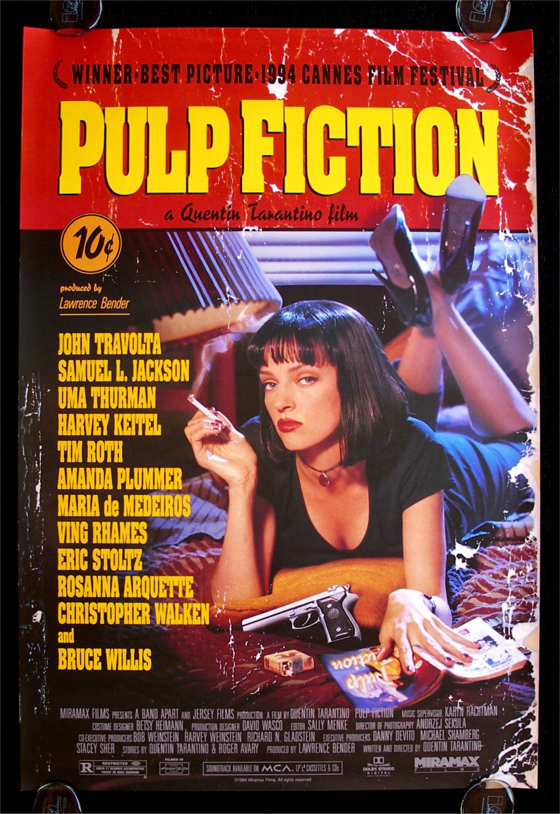
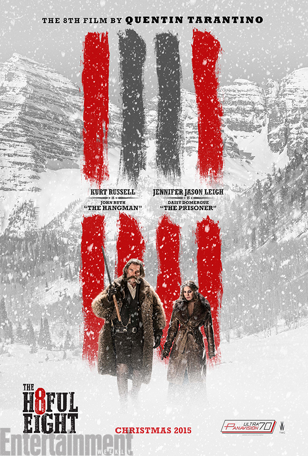
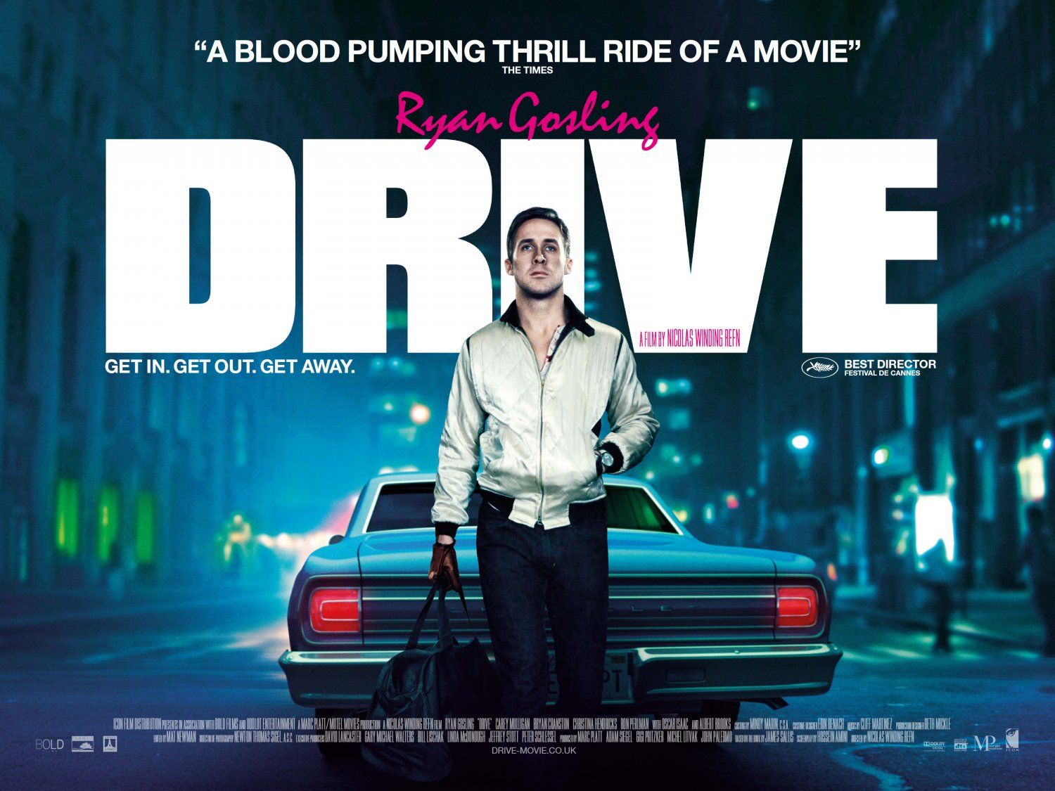

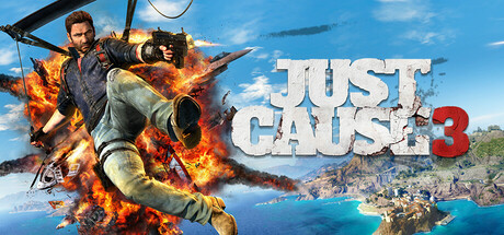
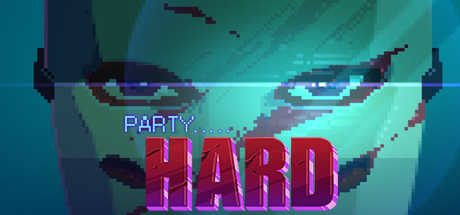
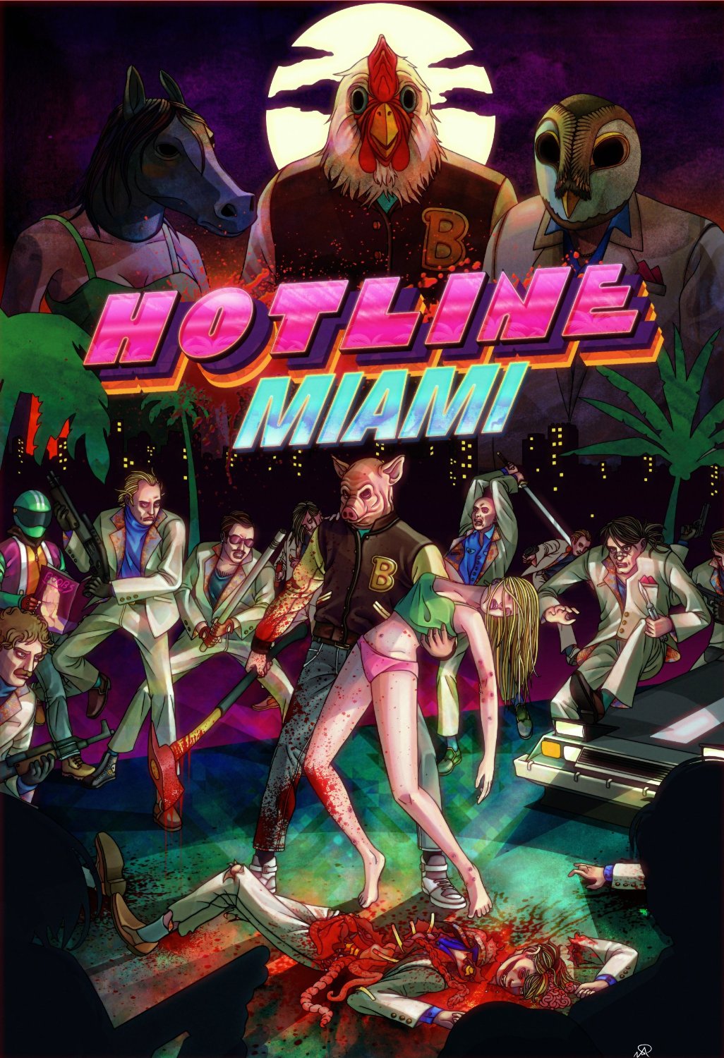


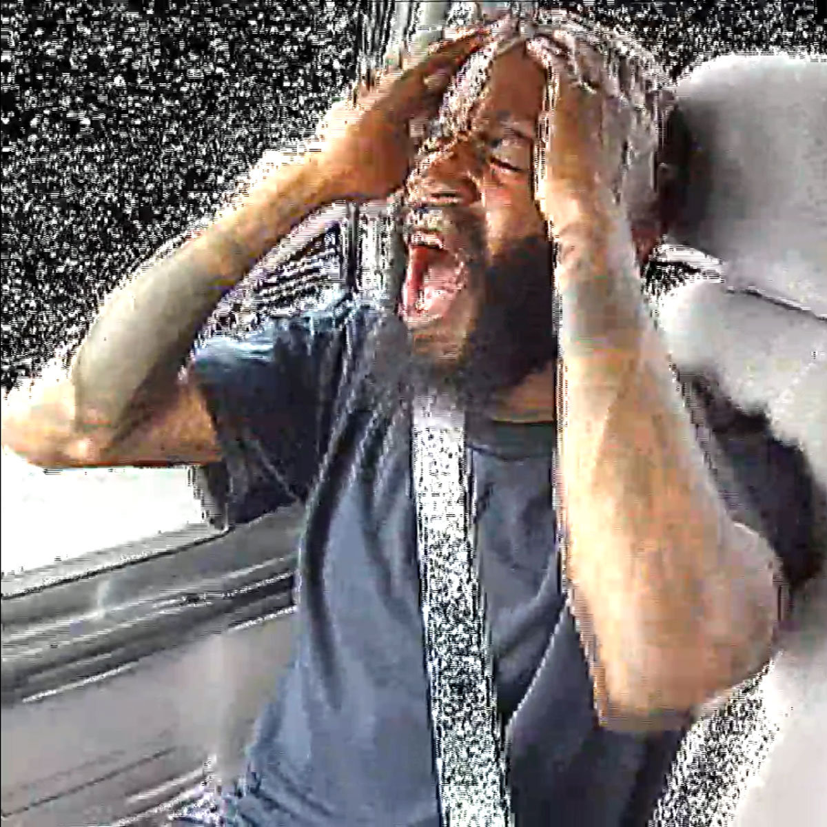


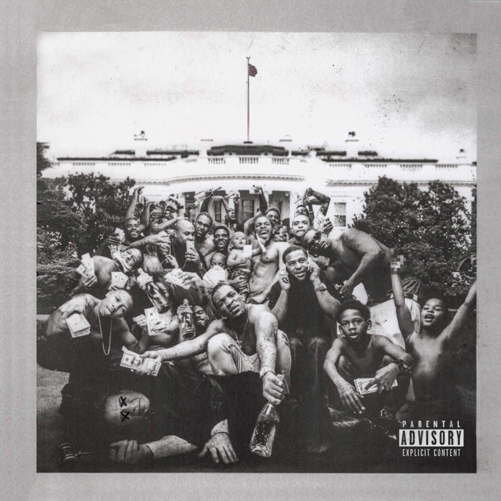
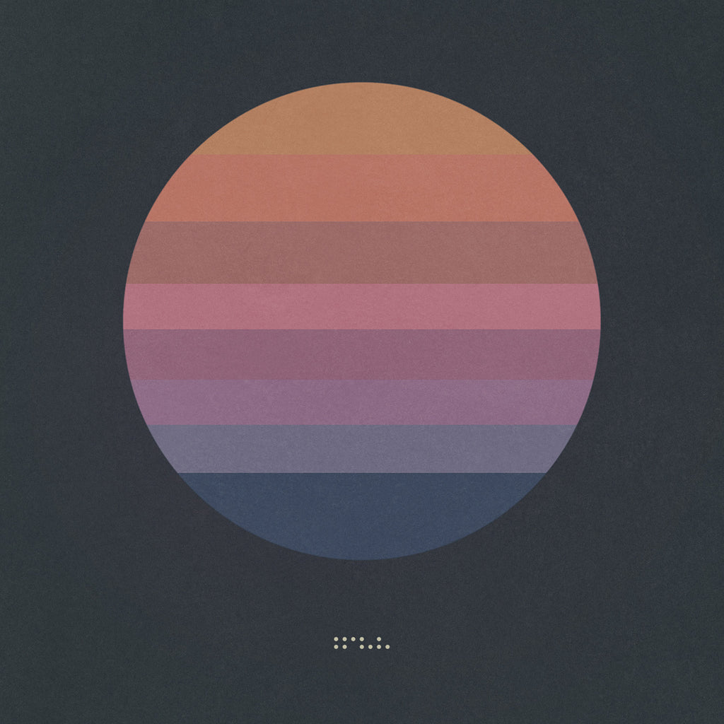
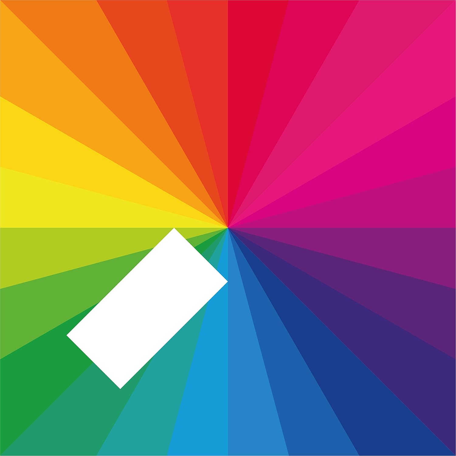

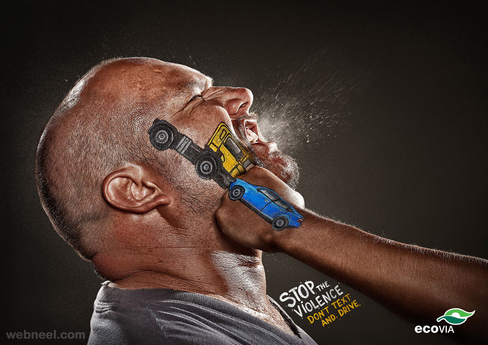


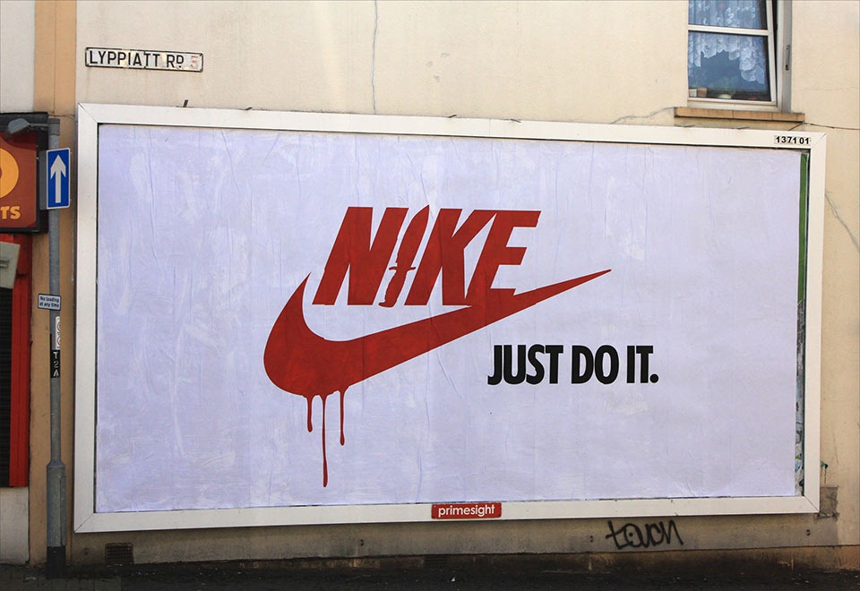





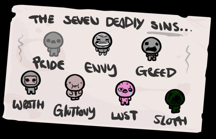

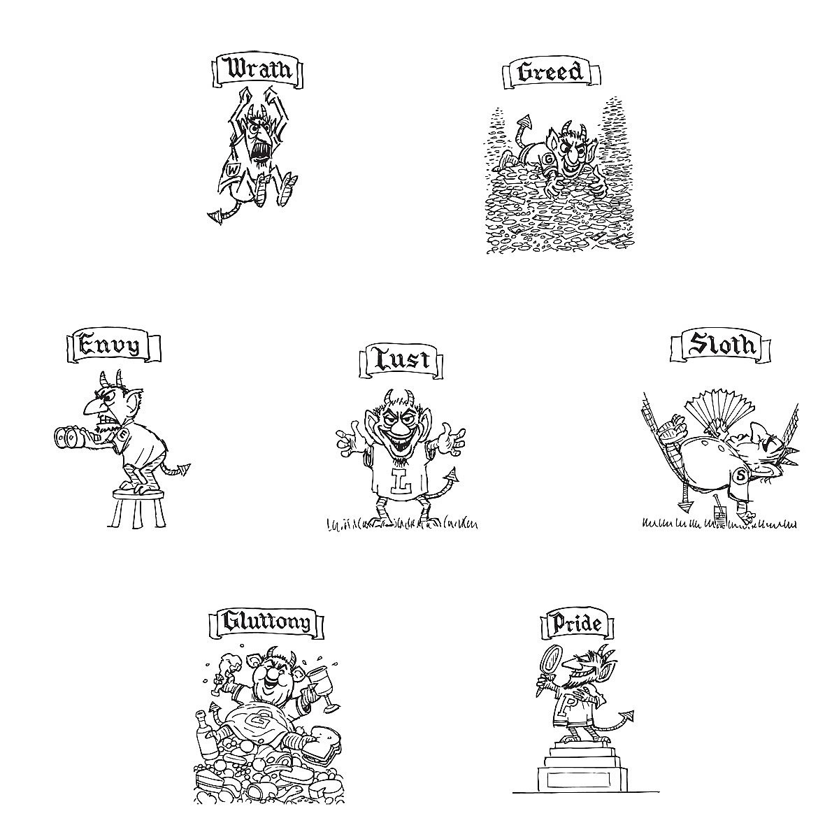

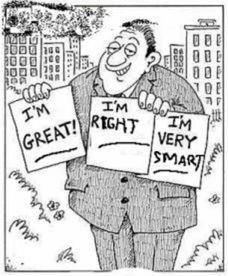


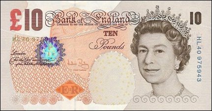


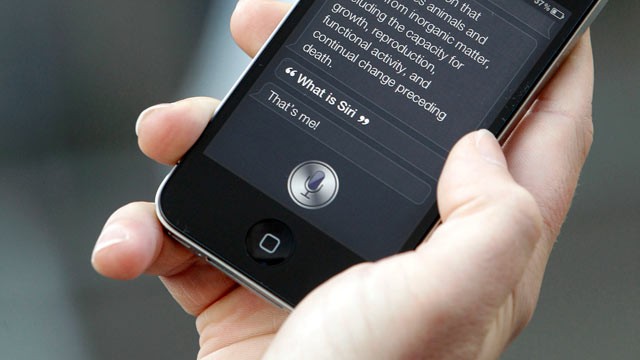


,_81.1_x_80.5_cm_(32_x_31.7_in),_The_Art_Institute_of_Chicago.jpg)